Friday 30 January 2015

Etoile Rouge Launch Night Posters

Etoile Rouge.
The client has asked for some posters doing for his first official night and launch party for Wide-Eyed. The main DJ will be the client himself, OWAY. Therefore I need to include this on the posters, I was also told to include the Wide-Eyed Logo as the main focus, keep the design 'simple' and 'cool'. I have been given the logo of the club that the launch night is at, which needs to be on the poster, and the colour red needs to be focused on too. He is wanting two posters doing, one being quite general, as OWAY is resident every Thursday at Etoile Rouge, and the other poster being the specific launch night poster with the dates of the launch night on there. From here it got handed over to Etoile Rouge who I am now arranging these event posters with.


Initial Ideas.
Incorporating the club logo into the poster is really important for this. The club wants to get as much publicity as they can from this. Although the logo that I have been sent is very small and pixelated. The quality of the logo is bad and the logo itself is difficult to incorporate it with the style of the brand. As the poster needs to be red, I think that I should I should include the colours from the logo, this will make it more in-keeping with the Etoile Rouge brand.

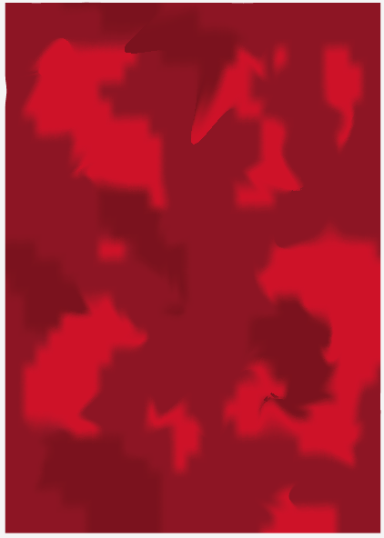
The logo of Etoile Rouge has an affect of a light red/orange merging out to a darker red, this is something that I plan to do with the poster, therefore creating a gradient will do this. Although the client wants a simple poster, I think this would be too simple have a gradient block colour.

I then decided that I would make it more 'mystical' like the client likes, by taking some darker and lighter reds and mixing them through a shape, then warping them so that it blends. This gives the poster a better effect, although I think that the colours will be too vibrant on the background and the gradient wont be seen, therefore putting a 50% opacity onto it will allow both effects to come through.

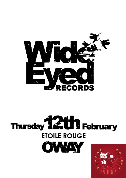
Using the information provided by the client, I am making the 'Wide-Eyed' stand out as the main focus, and the date of the event the next main focus, trying to include the logo of the club quite small but the name still standing out so that people can see where it is, whilst avoiding making the logo too big as it is harder to fit in.

Testing out different layouts and colours for the poster to communicate the event most successfully. 

The client has limited time and needed the poster doing in just a few hours for a meeting, therefore needed an example of what the poster could look like. I sent this to the client to suggest that this is the amount of information given, is this how simple they wanted it or are they wanting something a bit different. Also the logo is just too small and pixelated to be used. I will need to have a better quality logo if it has to be on there.

Speaking to the client.
This is the idea that the client has, he liked the background and some of the layouts, but needed the logo to be larger, or else his client wouldn't be happy (the club). Placing the logo at the bottom of the poster but larger and more fireflies.

Trying using different colours of the wide-eyed brand and different fireflies, I found that the black was just too harsh, as the client agreed. Also the logo that I have been given for the club does not work for this, it decreases the effect of the posters as it is such as bad quality image.

Experimenting with more fireflies, I decided that there are too many fireflies, and it take away from the event itself and is too over the top. The client would also agree with this as he wanted it to be simple.

This is the turning point of the posters. The Wide-Eyed logo can work as either black or white, which gives the great ability of it being able to go with anything. Using the Etoile Rouge colours for the Wide-Eyed logo makes them link more. I decided that I would redraw the the Eoile Rouge logo, which meant that I could also adapt it slightly so that it could look better and work well with the poster. The client allowed this as long as it wasn't changes too much it promotes the club. Although the client did not like the fireflies changing colour.

Trying to make the background stand out less by changing the opacity so that the logos can both be more prominent. Although it makes the poster look quite flat.

Instead of making the opacity less I decided to lighten the background colour. Also putting a white shadow onto the Etoile Rouge type makes it more like their original logo. I also needed to add in the clients name 'OWAY' onto the poster. Also adding a glow and light shadow onto the Wide-Eyed logo make it stand out a lot more.

From the poster I simply changed the type so that there is one launch poster and a generic one for each Thursday. Having constant communication throughout the process of producing the poster, means that the client has had a lot of involvement in the decision making. The client is very happy with the posters and is going to the meeting today. After this I will receive more feedback from it. This is the good thing about having live briefs on the go throughout OUGD603, as I can receive real feedback form a real clients.

Alterations.
After sending off the flyers, Etoile Rouge were concerned that their name wans't big enough on the posters, therefore I have made slight re-arrangements, takning away the circle as they don't wish to have Wide-Eyed in a circle.
This has been made, also landscape versions for the cover photo for social networks. Working with Etoile Rouge has been a really great experience, as I have been able to keep contact with different people and work to what they like, rather than just what I like doing.

Thursday 29 January 2015

Wide-Eyed Merchandise External

Merchandise Ordered.
For the brand and before the launch night the client is wanting merchandise. He is wanting a variety of different things, a lot of them I can print and produce myself, although there are a few things that are easier and cheaper to be externally printed and or made. For example a mouse mat, mug, iPhone cases e.t.c. The merchandise is mainly for the employees of Wide-Eyed, although he is wanting stickers to give out to people on nights out.

Everything the needed to be printed externally has been ordered. Although the client was wanting a zippo lighter for each of his employees. Although as it is a starting company with little incoming money, the zippos proved to be slightly excessive and expensive, therefore just the other lighters will do. The other lighters on the other hand will be printed internally, as I will be creating vinyls of the logo on lighters. As well as a few other things that the client is looking for.

Monday 26 January 2015

Wide-Eyed - Part 2 - Extra Brief

Wide-Eyed Part 2.
The Brief.
The owner of Wide-Eyed Records called Oscar is wanting more doing for his brand. He is wanting merchandise creating for his employees, and for some of the general public interested in his music. He is also wanting launch posters to promote his first night under his new label name. There are many different things that he would like for this brief, some of which I will be able to produce myself, and others which will need printing externally.

Deliverables.
  • Lighters - Both black and white
  • Dart flights - Both black and white, at least 10 sets of each.
  • Mug - One 
  • IPhone cases - Both for an Iphone5 and IPhone4 - in black and white
  • Beanies - Both grey and black
  • Hoodies - Both grey and black
  • Business Cards - More for the owner himself, plus three other employees
  • Launch Night Posters - Both Print and Digital versions
  • Cover Photo - For launch night
  • Website layouts - Content for website
  • Website Heading Illustrations - Heading for each page in 'Wide-Eyed' style

Although this is quite a lot of merchandise to produce, I think that it will be a good experience, as they will help the client and it is a live brief therefore I will be receiving feedback from an actual client. Also the first part of this brief lead me to receive another live brief from a new client. This may also lead to working with more clients as the launch night posters will be going through a club in Verbier. This is something that I am excited to do and see the results from, which will hopefully lead to more work and loyalty from the client.

Sunday 25 January 2015

Wide Eyed Brief Part 2


BA (Hons.) GRAPHIC DESIGN
Level
6
Module Code:
OUGD603
Module Title:
Extended Practice
Learning Outcomes:

BRIEF TITLE: Wide Eyed Records
BRIEF NUMBER: Brief 7 – Part 2

Brief:
Create more merchandise for the brand and the other employees at Wide-Eyed. Also create an online presence and EP covers for the new releases of tracks.
Background:
Producing underground house music, showcasing the music made in Verbier and Ibiza. Not a regular household name. Found by people who love and enjoy underground house music, not for commercial use.
Considerations:
Consider the audience and how to connect to them. Consider what printed ephemera will be needed, and the time scale so that it’s ready in time. Also look up other current house music producers and record companies to see how they connect to their audience.
Mandatory Requirements:
Knowledge on underground house music and other record label brands. Presentation boards for client.
Target Audience:
Underground house music phenatics. Mainly not a brand that people will find by accident, found by people who know, and people who are looking.
Tone of Voice:
Eye catching, fit in but stand out, original, serious and relaxed aesthetic, to the point.
Deliverables:
  • Lighters - Both black and white
  • Dart flights - Both black and white, at least 10 sets of each.
  • Mug - One 
  • IPhone cases - Both for an Iphone5 and IPhone4 - in black and white
  • Beanies - Both grey and black
  • Hoodies - Both grey and black
  • Business Cards - More for the owner himself, plus three other employees
  • Website layouts - Content for website
  • Website Heading Illustrations - Heading for each page in 'Wide-Eyed' style


Thursday 22 January 2015

Etoile Rouge Brief


BA (Hons.) GRAPHIC DESIGN
Level
6
Module Code:
OUGD603
Module Title:
Extended Practice
Learning Outcomes:

BRIEF TITLE: Etoile Rouge
BRIEF NUMBER: Brief 8

Brief:
Create event and promotional posters, flyers and a cover photo for the We Do Thursday’s launch night.

Background:
Etoile Rouge is a super club in Verbier, Switzerland. It is having a launch night for the event called We Do Thursday’s which is the name of the name which Wide-Eyed presents at Etoile Rouge. This is an underground house night, in a very popular club.

Considerations:
Consider the balance between promoting the club itself and the DJ’s that are playing. Consider the audience and what has previously been used as their event posters and flyers in the past.

Mandatory Requirements:
Research into the appropriate areas – Previous launch night posters and cover photos that Etoile Rouge have, also other event posters for other clubs.

Target Audience:
Underground house music phenatics. People who enjoy socialising and going out, also people who enjoy good music.

Tone of Voice:
Passionate, Fun, Inviting.

Deliverables:
  • Artwork to send as a JPEG to Verbier in A6
  • Artwork to send as a JPEG to Verbier in A3
  • Artwork for the cover photo of Etoile Rouge facebook page


Wednesday 21 January 2015

Tiger Print Evaluation

Evaluation.

I decided to do the Tiger Print brief, as I have previously done it before for a Valentines Day card brief, but I didn’t like what I produced, therefore I decided that I would do another one, and not settle for anything less than something that I like and think it appropriate and well produced. Trying to get people to look at Christmas in a different way, moving away from the materialistic presents and trying to make the holiday more personal and nostalgic. Focussing on the natural side of Christmas, for example a snowy scene or an open fire.

I am a lot happier with these Tiger Print submissions than any others that I have produced in the past for other competitions. I have learnt that I should only submit things into competitions that I actually am proud of and would put my name to. There are two patterns that I like more than the other two, and I am really proud of that them. This is my first competition brief completed this year, and although I only planned to spend a day on it, I found that coming back to it a few days later meant I could have a fresh look at it and change what I didn't like about it. If I were to do this brief again I would have maybe produce more variety of patterns, rather than three different snowmen and one tree pattern. Overall I am happy with the prints I have produced. And I think that making them into actual gift-wrap and bags and tags enhances the effectiveness of the design.

What I have learnt during this brief is that although sometimes it is appropriate to make mock ups, in this case the designs are more aesthetically pleasing when they are printed and made. This is something that I will always do in the future, make sure that I only use mock ups when appropriate.

Tuesday 20 January 2015

Chirstmas Gift Wrap Photography

Tiger Print Gift Wrap.
Photography.
For the tiger print brief I decided that I would just mock up each of the wrapping paper that I designed onto gift bags and tags, this meant that I didn't need to have them printed or make them myself, this would save me lots of time. Also because the brief was to create a surface pattern I didn't think that it would be appropriate to create the gift wrap itself. Although after creating my design boards, I found that it doesn't do justice to the gift wrap itself. Therefore I decided that I would chose my favourite surface pattern and create gift wrap, gift bags and tags, and photograph them for this brief. I will also include on one of my boards a range of all of the different surface patterns I made and that they would all work in this way.

At first I thought that it would be a waste of time to make and photograph these surface patterns, when I could just mock them up. But I think that after I have done it, it was really worth it as it looks so much better than the mock ups that I produced. Although I don't think that it is necessary to creating the gift sets for all of the patterns, just one to show in an example.