Saturday 28 February 2015

Syfy UK Brief


Feedback on Logos

Feedback.
Logo.
After sending the designs and ideas to Anna and Vanessa on the 23rd December 2015, I didn't hear anything back for about three weeks, although I know that both Anna and Vanessa are very busy and important women, I think that I should have heard back slightly sooner than this.

After contacting Anna who is the main decision making person in RayNite, she replied letting me know how much she loves the logos that I have produced and she doesn't think that anything needs changing on them, although she isn't too sure which one she is wanting to use yet. Therefore I replied suggesting that if anything does need changing then let me know and I will send her a higher quality copy of the logo when she has decided which logo she wanted to chose.

Not hearing back from Anna in another week I decided to email her again asking if she has decided which she prefers and what other ephemera she is looking for as well as business cards for RayNite. This is when Anna got back to me saying that she still hasn't decided which logo she wants, but has some bad news for me, that they are holding back on the plans for RayNite for another year, but said that they would definitely come back to me for the design work doing for it.

I am a bit disappointed but doing this has given me the chance to work with people that I don't really know and a real client, rather than just doing briefs to my own standard and preference. I will keep in contact with Anna and Vanessa and definitely work with them again, as even though this branding brief didn't go to plan and it being postponed, they are very important women who are good people to know and be in touch with.  

Train Livery Development

Train Livery.
We decided that one of our other two sections to complete for this brief was Train Livery. As Sarah Heal is doing environment, Mel and I decided that we would do the train livery. We didn't really discuss what to do, apart from we knew that we would have to come up with a design for the actual aesthetic of the train.

We went away and started to work on what we were going to do, and came in the next day to discuss what we could do. We found that we both had a very similar idea for the train aesthetic, using the purple and darker purple as a theme. We both used the same colour scheme as we had for the posters to keep it consistent. From this we decided that Mel would move froward with her outside of the train, and I thought that I would do the inside of the train.

Train Livery.
  • Outside
  • Inside
  • Seats
  • Reservation Tickets
  • Tickets
  • Toilet Signs
  • Baggage Signs
  • No Smoking Signs
  • Coffee Machine
  • Cup Ephemera
I started to think about the different things that could be included in the train livery rather than just the train. This brief is about exhausting the details of the brand, looking at the small things and thinking about everything that would be included and would matter in the Capital North brand. Therefore I thought that I would start by designing the inside of the train.
Sticking with the same style of the rest of the illustrations and the same colours scheme, I decided to keep within those, mix and match, to find what looks best. I think that the purple and cream looks best for the seats, therefore this is what I am going with.
I thought that as the detail is so important when it comes to this brief I should include reservation tickets, so that it would show how it would look when people had reserved their seats like they do on trains now. As well as doing this I thought that I would look into the type of people that will be using the trains. There would be so many different audiences that will use the trains, although what they will all have in common is that they will all get traveling somewhere at speed. I thought about creating a menu for some food, but thought that the people wouldn't be on the train of that long, so a branded coffee machine would work better.

Making sure that all of the features of the train look the same is important, they all need to be able to work together and are noticed as the same brand, the Capital North.
Taking the opportunity to use the free space to advertise the Capital North benefits and offers. This is something that would be done in real life, using advertising space efficiently. All of the inside looks great as a set it work really well together. Whilst I was doing this Melissa was doing the exterior of the train, this also matches that and goes with what we are doing. This will work really well to reinforce the brand itself and show what it has to offer.

Friday 27 February 2015

Applying Vinyls

Vinyls.
I think that for a lot of the products and merchandise I will be able to produce them using vinyl stickers. For example the dart flights, lighters and phone cases can be done using vinyl. Also heat press vinyl will be used for the hoodies, tshirts, and hats. The client requires a lot of dart flights which will take a lot of time to cut out on the vinyl cutter, also it may take a while to peel off.

Heat Press Vinyl.
The heat press vinyl I found really easy to peal and get right where as the normal vinyl was a lot more fiddly. I have found that I will be able to produce more things in future using heat press vinyl.

Normal Vinyl.
I got some of the vinyls cut and found that the small detail in them didn't cut well, therefore I am going to re-cut more out and remove the fireflies from them. Just so that they look a lot smoother and work better. This will also make them easier to peel. Especially as there are 30 sets of white and 30 sets of black dart heads which are really small and fiddly to do as it is.

I tried a few different layouts of the vinyls, and showed the client, and he decided on what he wanted where, for example having just type, just fireflies, or a mixture of both, also how many of each. He decided on using both, on every other side, suited for right handed people, as everyone who works for him are right handed.

As well as dart flights there were phone cases. Although there were some ordered online, they were really bad quality therefore making them with vinyl has worked a lot better and has meant that I could create more for less money.

Overall I think that using vinyls has worked really well and has meant that there could be a lot of things produced for Oscar at a lower cost, still with the same quality, if not better for some of the items.

Wednesday 25 February 2015

Animated Poster

Poster Animations.
We all started by coming up with our own fact for the North, and illustrations to demonstrate the fact. We decided that we would all have a go at animating so that its fair and we could all practice After Effects more.after a lot of different choices and development of the poster it was finally ready for animating the poster.

My Animated Poster.


DBA - Less Squeeze from Daisy Sunshine Conway on Vimeo.

Evaluation.
I am really happy with my poster, I think that it works really well. I am glad that we decided that we would all create our own animations, as previously the decision was made that Sarah G and Danielle would create them all so that they are consistent. Although it has worked out better as we all know how our illustrations are going to work therefore it will look better if we all do our own. It has worked out that we came up with key frames to follow throughout the animation, so that all the text comes in at the same time on each poster. This made it more consistent also. I am really happy with how we are working as a group, and the animated posters look really good as a set.

Sunday 22 February 2015

Illustrated Poster Redone

Less Squeeze, More Space.
When it came to my illustrations, I wasn't happy with them, and thought that it it was quite irrelevant to the concept having lots of balls in a box. Although when changing the colour scheme, it did allow it to look slightly better although I started to think about more conceptual way to demonstrate this. After doing this I came to the idea of using balls to demonstrate the squeeze moving into space. But instead of being in a box, I will have a small gap and use the grey colour so that it looks like a lift. Then the doors will slowly open so that the balls will have more space. This just makes it more real and relateable to people without having to illustrate people.

New Illustration for Posters.
I am a lot happier with these illustrations for the animated posters. This could also link to the environmental part of our brief and have the posters located in lifts or near lifts in train stations. The colours are a lot better and more professional whilst still being approachable. I think that this will appeal to many different audiences, although specifically this will probably be aimed at business people who use lifts a lot.

Enviroment Research

Environmental Research.
Ideas.
We have not yet set which tasks each person will be doing, apart from the posters themselves. I think that it would be really interesting to do the environmental parts of this brief. It will mean that I would be able to be really creative in what I can do. If someone else does it then I can still offer some creative ideas for what they could do whilst I am doing my own part. We all decided to go away and think about what we would do for environmental and train livery, then we would get back together and discuss ideas and allocate jobs in our next meeting.

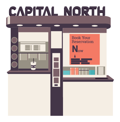
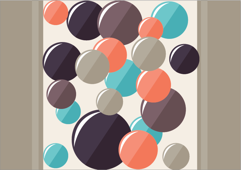
When thinking about Environmental I started to think about what would be found in a train station and what would go with our poster ideas. Escalator is a good thing to work from as it is something that you can find in many different places, train stations being one of them. Also my poster is about being really squashed, and showing that the north has got more room, the poster itself shows balls in a lift. This could be displayed near a lift, or inside one or is could turn that idea into a real situation. For example the balls could be on the outside of the lift with lots on it and when the lift opens up into less balls around the lift and more space. Showing how the poster works in reality.

Examples.
Source
Source
Source
Having the logo or some sort of colour scheme with positive quotes on the stairs. Words suggesting to come to the North, playing with the idea of going up the stairs/lift/escalator is going up too. Using lights and maybe glow in the dark to highlight this.
Source
Source
Source
Source
Using large or small distortions of things. Such as the way finding in the train station, or even in side the train as the train livery being cleaver and toying with the idea of things being reality. Having the logo of things like walls, doors, blinds, or anything that can only be seen at a certain angle. Could also play with the idea of information graphics, quotes or even simple images/illustrations on the ceiling, and logos pointing to the North, encouraging people to look up to the ceiling.

Source
Source
Something interactive could be good for this brief. Something that people will remember or take away with them when they are using Capital North trains, or even an experience that last from the train and makes the audience gain a stronger relationship with the brand. Unsure on ideas of this, but I like the idea of having something to take away, like the posters on the lamp posts with tear away strips. It is something different and something which will attract people to Capital North.

Source
Source
Source
Source
Playing with a different tone of voice to connect with different audiences could be a good idea for the environmental. This is an opportunity to have some fun, and make the brand more light hearted and show how the Capital North is welcoming to all. Avoiding using something too childish like characters such as the Simpsons escalator, as we don't want to take away from the business men and women who would be using the train, but we also don't want to be fully corporate, as this may lead others from using Capital North, when really, everyone is welcome.

When it comes to the environmental side of this brief, I think that we should be as creative as possible to show how much life Capital North has, showing that it more than just a brand or a place, it has life. This is something that we are trying to make shine through our brand. The North is a friendly place and what makes it so special are the people who live there, this is why the North is such a nice place, this is something that we need to emphasize when presenting our brand to DBA.

Next we will discuss all of our ideas together, and distribute jobs and tasks for each person in our group. This is so that we can get as much as we can done, whilst letting everyone have an input in the ideas and the overall concept of our brand, Capital North.