Train Livery.
We decided that one of our other two sections to complete for this brief was Train Livery. As Sarah Heal is doing environment, Mel and I decided that we would do the train livery. We didn't really discuss what to do, apart from we knew that we would have to come up with a design for the actual aesthetic of the train.
We went away and started to work on what we were going to do, and came in the next day to discuss what we could do. We found that we both had a very similar idea for the train aesthetic, using the purple and darker purple as a theme. We both used the same colour scheme as we had for the posters to keep it consistent. From this we decided that Mel would move froward with her outside of the train, and I thought that I would do the inside of the train.
Train Livery.
- Outside
- Inside
- Seats
- Reservation Tickets
- Tickets
- Toilet Signs
- Baggage Signs
- No Smoking Signs
- Coffee Machine
- Cup Ephemera
I started to think about the different things that could be included in the train livery rather than just the train. This brief is about exhausting the details of the brand, looking at the small things and thinking about everything that would be included and would matter in the Capital North brand. Therefore I thought that I would start by designing the inside of the train.
Sticking with the same style of the rest of the illustrations and the same colours scheme, I decided to keep within those, mix and match, to find what looks best. I think that the purple and cream looks best for the seats, therefore this is what I am going with.
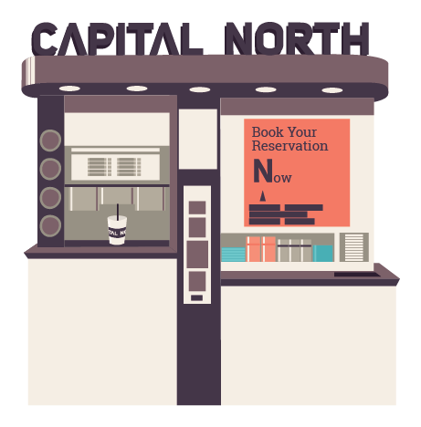
I thought that as the detail is so important when it comes to this brief I should include reservation tickets, so that it would show how it would look when people had reserved their seats like they do on trains now. As well as doing this I thought that I would look into the type of people that will be using the trains. There would be so many different audiences that will use the trains, although what they will all have in common is that they will all get traveling somewhere at speed. I thought about creating a menu for some food, but thought that the people wouldn't be on the train of that long, so a branded coffee machine would work better.
Making sure that all of the features of the train look the same is important, they all need to be able to work together and are noticed as the same brand, the Capital North.
Taking the opportunity to use the free space to advertise the Capital North benefits and offers. This is something that would be done in real life, using advertising space efficiently. All of the inside looks great as a set it work really well together. Whilst I was doing this Melissa was doing the exterior of the train, this also matches that and goes with what we are doing. This will work really well to reinforce the brand itself and show what it has to offer.


No comments:
Post a Comment