Less Squeeze, More Space.
This is the short quote that I have decided to illustrate for my poster, this is becasue there is more space up North, and there isn't loads of people pushing their way around as much. This could be a reason for people to invest in the North and bring their business up North, as it has a lot of people but not everyone is too squashed in. After doing lots of research of statistics about the North and the space it has compared to the population. The quote I found to use is...The North West is the second highest densely populated area in the UK. Although the North West is ten times less densely populated than London. Therefore it shows that the North is big, but not ridiculously packed in.
After our last group meeting we decided that we would go with Sarah G's illustration style and colours. After this she made her illustrations into the animated poster. I really like the animation and think that it works really well. Therefore we are all using it as a base to create out own animations. Therefore I need to stick to these key frames so that they all work as a set.
Starting to think about what my actual illustration is going to be, I started by thinking about having lots of people or houses then them suddenly spreading out and going into more space. I originally thought about having a hand squeezing the earth and then letting it go so that the earth goes into space. Although I like the idea of it, I don't think that it will go with the colours that we are using and wont fit in.
Although I am not going to use the hand and the earth. I thought that I could use a hand and a ball and have the same idea but with different objects. Also a box full of balls, then the balls get released and find their own space.
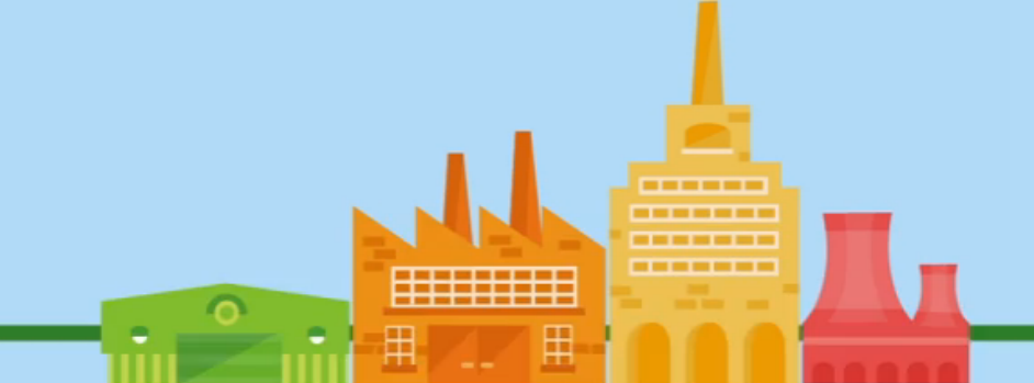
These are the illustrations that Sarah G produced and are what we are trying to create the same style of. From this I took the main colours out of it that I could use them, and knew what I would be working with.
I started with the idea of the hand squeezing the ball. As I have already illustrated the hand for my original suggestion for the illustrations, all I had to do to this would be to change the colours.
Example 1.
I have decided that I would produce another set of illustrations so that I can get the opinions of others in my group, as I don't know if it is too much detail with the hand, or if it is doable for us to create a moving hand on after effects.
Example 2.
After speaking to a couple of members of our dba team, we have decided that the box animation will be better. It means that there is less detail, which works well with our concept of less is more, less is North. Also as we are all quite new on after effects, especially me, who has only started learning to use the software for this brief. I think that the hand will be hard to illustrate and make move, whereas the box might be easier.
Moving on from this I am going to try and put it on after effects and animate it. The aim is to keep it simple and 'less'. Also trying to make all of our animations work well as a set. The end of the animation says 'Less is More,' then the 'More' turns into 'North', after this our secondary logo appears and moved into our normal logo. This is a sequence that Sarah G has already produced. Therefore it will save everyone else time, as we don't have as good of skills on after effects, also it means that all of the endings are consistent.
This brief so far is going really well. As a team we have taken the brief seriously, and have put our all into it. We have worked really well as a team, and I would always work with any of my team again, as it is very enjoyable, and we have got more work done, as I think we bounce off each other.


No comments:
Post a Comment