Less Squeeze, More Space.
After our last meeting we all decided on which quote we would use, and mine is less squeeze, more space. We all thought that we would go away and create our own illustrations for our posters, then from this we can bring them together and decided which kind of illustrative style and colours we could use. I decided to take mine a bit further and show how my idea would work as key frames in an animation, just to see if people liked the idea.
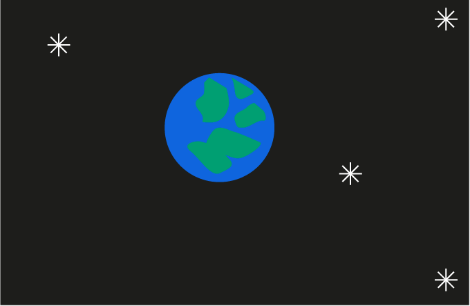
For this part of the brief I thought I wouldn't explore many different ideas I would just go with one that I thought might be quite clever and a play on words. Using the idea that someone is squeezing the earth, then letting it go into space.
I have tried to go with a simple illustration with not too much detail, this will help with the idea of the less is more concept too. Highlighting and shading parts of the hand makes it look more like a hand and less like a blob.
Then the Earth would move out into space, showing some stars and planets in space. These illustrations are very simple and minimal too, this is the style that I have gone for.
All of the key frames put together to show how mine would look. Although I'm not sure about the actual theme of outer space, it might be making the animation more complicated than it needs to be. Although I think that the simple illustrations are the way to go with this brief, the simpler the better. From here I will go and meet my group and see what everyone has come up with when it comes to the style of illustration. So then we can makes a decision and move onwards from it and start producing the posters.


No comments:
Post a Comment