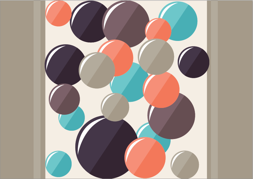
When it came to my illustrations, I wasn't happy with them, and thought that it it was quite irrelevant to the concept having lots of balls in a box. Although when changing the colour scheme, it did allow it to look slightly better although I started to think about more conceptual way to demonstrate this. After doing this I came to the idea of using balls to demonstrate the squeeze moving into space. But instead of being in a box, I will have a small gap and use the grey colour so that it looks like a lift. Then the doors will slowly open so that the balls will have more space. This just makes it more real and relateable to people without having to illustrate people.
New Illustration for Posters.


No comments:
Post a Comment