Website Design.
Another things that needs doing for this brief is a website. The client is creating their own website, although they require images and designs done for each of the pages. The information and most of the images have been provided although some of the images need tweeking slightly. Everything is to remain black and white including the images. Also greyscale options are available too.
(insert images for sketches)
I started by thinking through what will look right for this brand. Oscar also suggested a few things that he would like to see and how he would like them to look. The website needs to be simple so that the information is clear on it, also so that the navigation is easy to make when he is doing it. Therefore I am going to stay away from rollover buttons and too much detail when it comes to the navigation.
Homepage.
I started to think about the navigation first and I think the most appropriate method would be to have a bar across the top, using the 'Wide-Eyed' type as the headings for the different pages. Although I think that it would work better if it were just the type that is in the style of Wide-Eyed, then on the titles of each page, they will include fireflies coming from it like the logo but more scattered.
Trying the logo on the and the fireflies on the homepage looked a bit plain, therefore I decided to use one of the images provided originally for the 'About' Page. I think that this works really well in the background for this page. I think that it might work over many of the pages. Although I think that having a black navigation bar with white type and logo might look better.
The black navigation bar definitely looks better, and this will be what I am pitching to the client to use. It is not too plain, but shows the record company quite well. Sticking with the black and white images makes the aesthetic consistent with the brand.
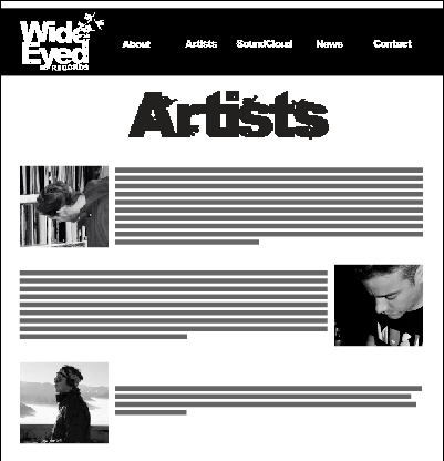
Artists.
Originally I thought that this wouldn't need to be a static website, although after trying to fit things in on the artists page I have realised that to make it all fit the page will have to expand. Although this won't be an issue, as the News page and SoundCloud page will also expand.
Again having a background to the page makes it bless bland and more interesting. I think that websites that are on a plain white background make them look tacky. This is something that I don't want Wide-Eyed to look like as I think that this record company is the furthest thing from being tacky.
Trying the artist page with the images coming from mixed sides and fromt he same side allowed me to see how this would work. Although I think that it probably look better and will read better if the images are at the same side of the page.
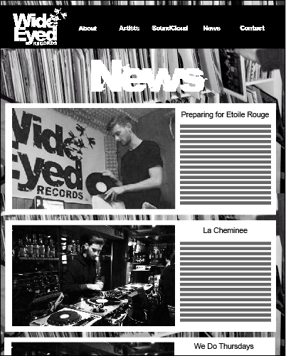
News.
The News page will be updated all the time therefore will only be expanded when there is a new update. I thought to keep the website consistent I would use a similar layout with the type and image, with the white background to them. Although having a larger image on this is very important so that people can see the event taking place.
About.
With the about page there isn't a lot that I can do with it as it is simply information. After seeing this I started to think about producing a narrow layout.
Narrow layout.
I personally prefer the narrow layout, as it will link more with the about page. It also allows the background image to be seen more. I think that the background image works well with this. And if the client doesn't agree I think there needs to be something in the background, as a plain white makes it look tacky. The image in the background would be locked, and the information would move when scrolling.
What's Next.
Wait to hear back from the client and see what he thinks.
Do any ammendments.
Send over the files as a png so its web compatible.
After Speaking with the client.
He liked the layout although suggested that the white was a bit harsh, so I have put it down to an opacity of 80%. This just brings down the harshness and enables people to see the image more in the background.


No comments:
Post a Comment