Printed Patterns.
Both Mel and I decided that we wanted our logo to be quit plain, and
stick to the colour plan. Whilst doing this we want to include patterns
for each section of the menu. This is so that the milkshake flavours and
jars will all have a printed pattern on the label. Therefore I decided that I would start to think about each of the flavours and which patterns I am going to make for each, whilst Mel is working on the wall and table menus. We decided that we want to pattern to be mostly outlines and vector illustrations. Also the pattern is to be used as a background thing rather than the focus of anything in the milkshake bar.
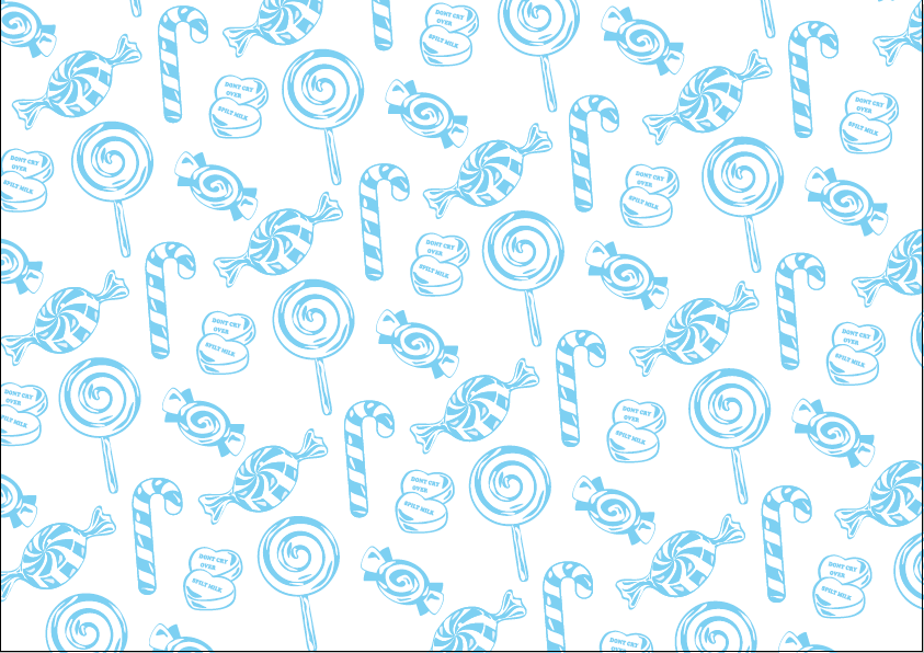
Sweets Pattern.
The illustrations all need to follow the same or a similar aesthetic as each other. This is why I think it will take a lot longer to do the sweet pattern than the others as this will be the first one. The illustrative style that I think will be best for Spilt Milk is to have minimal detail in the illustration, but allowing the distinctive parts to stand out.
Whilst making the illustrations I played with the proportions this is so that I can make all of the aesthetics the same.
After creating four different sweets I thought that I would try using some of the other colours in our colour scheme. Although after doing this I have realised that this definitely doesn't work like this, and I don't think that these colours would print well on each other, although it could be a coloured stock.
Sticking with the cyan and white, I tried two prints when putting them together. One which is is more spread out, and the other which are closer together to get more of the print in. I sent both of these patterns to Mel to see which she preferred, as I don't really have a preference. The one Mel preferred was the more spaced out pattern. Also she said that she loved the pattern and the style of them, this means that I can now move forward with the rules that it is outlines and slight detail only, using cyan and white, spaced out a bit, and using five of each thing.
Fruit Pattern.
After doing the first pattern which was sweets, the rest of them came quite easily as I have now got something to work from. Using the same colours, style, spacing, and amount of things in the pattern, therefore it is just about keeping the same style as I have drawn the others in.
Cake Pattern.
I have decided to start putting all of the illustrations in separate files so that they don't get lost and there is always a back up. Trying out different layouts is important, so that I can have them all fitting together well.
All of the cakes and biscuits used in this pattern are on the menu. This is so that if people do see the pattern when coming into the milkshake bar they could see a bake well tart for example and think, yes that's definitely the milkshake that I would like. This adds to the effect of the patterns, making them have a subtle influence on the customers.
Chocolate Pattern.
Chocolate was definitely the hardest pattern to illustrate. This is becasue chocolate is very hard to illustrate as the chocolate that we have on the menus are distinguished by taste. Although we do have a few different chocolates that are different shapes, this really helps to distinguish each iconic piece of chocolate.
Overall I am really happy with the patterns, they work really well together, and I think that the labels will benefit from these a lot. I also think that having a subtly pattern in the background of things, or from the back/inside of things is very fitting with this brand. As Spilt Milks aim is to sell milkshake but also to bring people together socially. WE will do this using social networking, having games and competitions in store and getting people to drink/eat in, instead of most milkshake shops which try to sell a lot and don't really have a comfortable environment for people to sit in.