Showing posts with label YCN. Show all posts
Showing posts with label YCN. Show all posts
Thursday, 21 May 2015
Wednesday, 20 May 2015
Syfy Submission Photography
Syfy Advertisement.
Photography.
The Syfy brief was create anything that would connect with the Syfy viewers to get them more interested in the Syfy channel and make people want to watch it more. This could be anything from creating a TV advert to creating an event. Whatever you find will work best to connect to the viewer. Therefore I decided to create an advert that would connect to the Syfy viewers and get them to watch more of their programmes, and believe in the brand more. Because the brief is an animation, with some posters to go along with it I think that it would be most appropriate to hand in the animation on a disc and the posters.

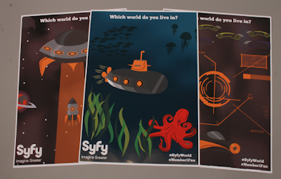


I think that photography of posters is quite hard, therefore I did the best that I could with them. Although I think that the lenses of the cameras are quite bad as there are speckles all over the lenses which I will now have to photoshop out.
Photography.
The Syfy brief was create anything that would connect with the Syfy viewers to get them more interested in the Syfy channel and make people want to watch it more. This could be anything from creating a TV advert to creating an event. Whatever you find will work best to connect to the viewer. Therefore I decided to create an advert that would connect to the Syfy viewers and get them to watch more of their programmes, and believe in the brand more. Because the brief is an animation, with some posters to go along with it I think that it would be most appropriate to hand in the animation on a disc and the posters.


I think that photography of posters is quite hard, therefore I did the best that I could with them. Although I think that the lenses of the cameras are quite bad as there are speckles all over the lenses which I will now have to photoshop out.
Sunday, 10 May 2015
Sunday, 19 April 2015
Syfy Evaluation
Evaluation.
The Syfy
UK brief started as a huge challenge for me as I wanted to explore into more
than just creating a printed campaign. As I had just completed a small
animation for another brief I thought that this would be a really good
opportunity to do this. Also after researching into the brief, I think that the
most appropriate method of creating a campaign and adverts for the brand would
be to create a video or animation. This is something that took quite a long time
but it was definitely worth it.
The skills
that I have developed during this brief was definitely working out how to set
up files for an animation, also using After Effects. This is a skill that I
have always wanted to develop, after doing this I have realised that I would
love to do more animation. Also that I don’t think that anyone has to choose
one path to go down in graphic design as there is a huge relationship between
print and digital that I would like to explore more. I think that due to the
fact that this was my first real animation designed, that I should have practiced
a lot more, although I am happy with it. If I were to do the brief again I
would make the animation slightly shorter/quicker, so that it all moves
slightly faster than it currently does.
The
outcome for this brief and the concept is very relevant for the brand and the target
audience. This is strength in the animation and the brief. It highlights
everything that the brand stands for, and attracts the right target audience,
delivering the most direct message whilst still allowing their imagination to
run wild. This is the intention of the TV advert.
Thursday, 19 March 2015
Syfy Development
Syfy Development.
After deciding that I was going to create an animation I started to think about what I was going to include in it. I decided to start creating the scenes in illustrator so that they are ready to animate. This means that every moving object needs to be created in a different layer.
Future.


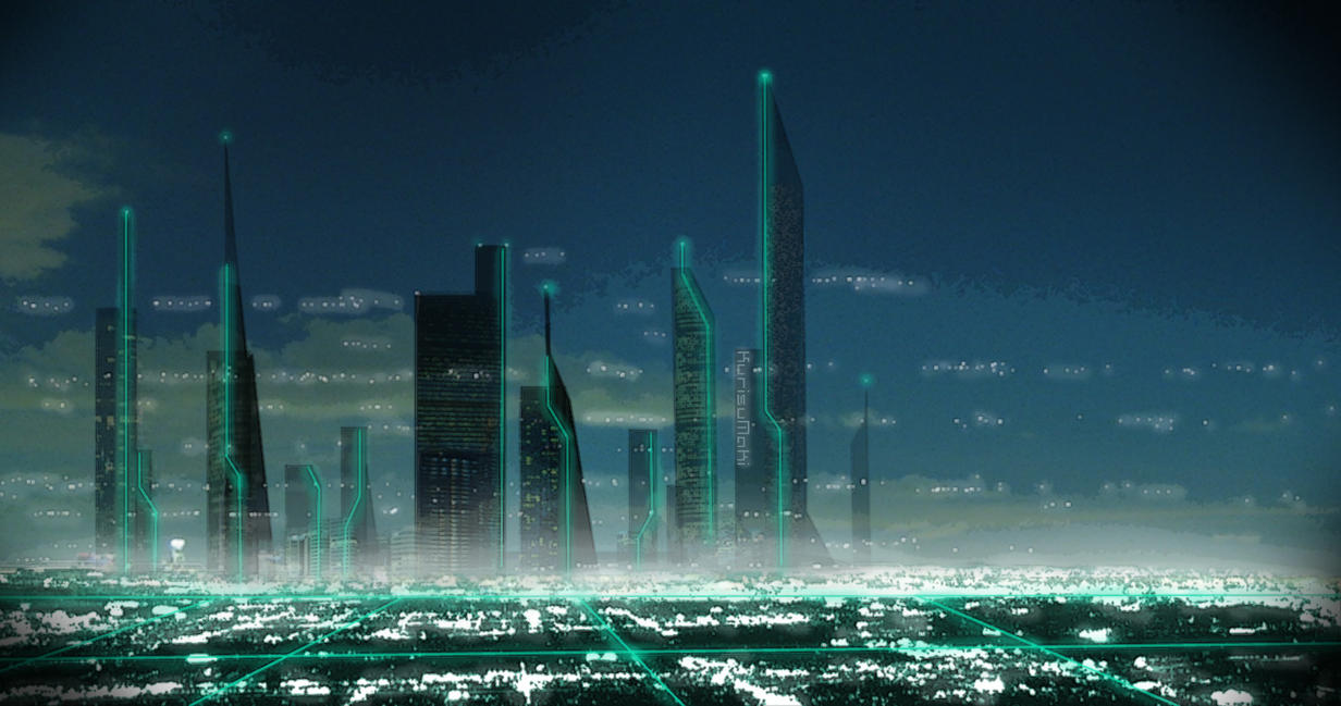
 I found some images of the futuristic world and how it could look making it look most similar. Although I have found that it looks nothing like a realistic futuristic world therefore I need to go with something a bit more simple and to the point.


 This looks a lot more like a futuristic world than the first attempt. It also means that I can keep a consistency throughout the animation as I will keep the illustration style the same throughout.

 I also decided that in this scene the method of transport would be a flying vehicle in the sky, this would be a futuristic vehicle, that would fly around in the sky on the animation.
Screens.


 Throughout the animation there will a be a vehicle running throughout transferring the viewers into different the different worlds through zooming into the screens, then back out into different worlds.
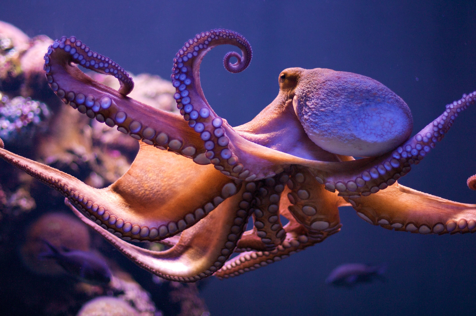
Under the Sea.

 Choosing a colour scheme that will work for the under the sea scene is important. also I want the scene and the background to look as real as possible, this is why I thought that including the sun rays and highlights on the water would be a good idea. I will make these have an opacity in the animation so that it will fade in and out to make the water look like it is moving and look more real.

 I also decided to create some creatures in the sea so that the submarine would pass some things under the water, this will also make the scene seem more real.


 These are the screen developments for under the water, the layouts of the screens are all the same with different levels and information on them. Using the orange will connect with submarine used in the sea scene, the rocket in the space scene and the flying car in the futuristic scene.
Space Scene.

 The rockets illustrated for the space scene keep within the same colour scheme as all of the other main objects in all three of the scenes.


 Making the scene darker will help the idea of the futuristic scene, it will create mystery in scene which I think is important for this scene.

 As well as there being a rocket in the space scene there will be the mother ship to take the rocket away and transport that in to a different world.


 Some of the posters produced to support the adverts so that they can work 4D, experiencing the posters through time and taking the viewers on a journey.
The Logo.


 Deciding on the logo colour and what I would do with it. I decided that I would get the mother ship to take away the rocket and spit out the logo then saying, which world do you live in at the end to some it all up.
Making the Animation.
Unfortunately I didn't take any screen shots throughout the making process, this is becasue I don't have After Effects on my mac, therefore I had to use the uni macs, and was in a rush when it came to the actual making of the animation. This is becasue I spent too long deciding on the actual ideas and the illustration for the animation, therefore I saved every second I could get before the YCN deadline. Although I feel that the animation went well and I have learnt so much during this brief.
After deciding that I was going to create an animation I started to think about what I was going to include in it. I decided to start creating the scenes in illustrator so that they are ready to animate. This means that every moving object needs to be created in a different layer.
Future.


Screens.


Under the Sea.


Space Scene.


The Logo.


Making the Animation.
Unfortunately I didn't take any screen shots throughout the making process, this is becasue I don't have After Effects on my mac, therefore I had to use the uni macs, and was in a rush when it came to the actual making of the animation. This is becasue I spent too long deciding on the actual ideas and the illustration for the animation, therefore I saved every second I could get before the YCN deadline. Although I feel that the animation went well and I have learnt so much during this brief.
Friday, 13 March 2015
Scene Research
Scenes.
After deciding on some of the scenes I thought instead of continuing looking for more scenes, I will focus on these ones, and will create more if and when they are needed. The three that I have thought about so far is Space, Under the sea, and Futuristic.
Space.
The space scene needs to be minimal yet not childlike. I don't want and of the scenes to look childish, although I do want them to look approachable and minimal.
Under the Sea.
Researching more into under the sea. This is so that I can reference more of the colours and scenes throughout. The colours are quite deep and vibrant. Something to consider whilst illustrating.
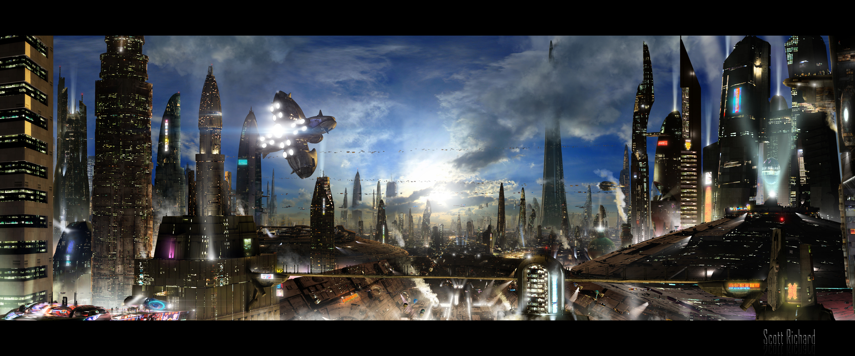
Futuristic.
I want the colour schemes used to stay the same or very similar throughout, and I want all of the colours to be a deep. Also I want to reference the brand colours within this, so include some purple black and white.
After deciding on some of the scenes I thought instead of continuing looking for more scenes, I will focus on these ones, and will create more if and when they are needed. The three that I have thought about so far is Space, Under the sea, and Futuristic.
Space.
 |
| Source |
 |
| Source |
 |
| Source |
 |
| Source |
Under the Sea.
 |
| Source |
 |
| Source |
 |
| Source |
Futuristic.
 |
| Source |
 |
| Source |
 |
| Source |
 |
| Source |
Subscribe to:
Posts (Atom)