Showing posts with label Part 1. Show all posts
Showing posts with label Part 1. Show all posts
Thursday, 21 May 2015
Wide Eyed Evaluation
Evaluation.
The
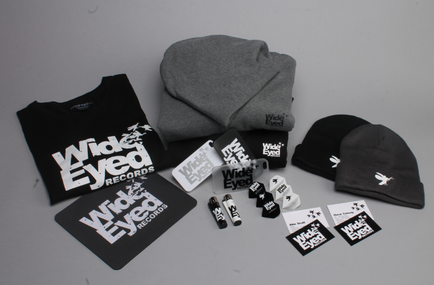
branding for Wide Eyed Records went really well. The idea of creating a brand
that shows something new and fresh, but also like a wonderland, works really
well for Wide Eyed. The brand itself is fresh and new this reflects in the
logo. After doing this brief the client came back and wanted more merchandise
doing, and wanted to expand his brand online and create an online presence. The
range of merchandise created was appropriate and the client was happy with it
all. If I had more time on this brief I would have suggested producing record
sleeves and vinyl labels for when he starts to get his vinyl’s made for his
tracks, although he said that he would always come back when he needs something
else designing. I am really happy with the branding itself I think that it
really suits the concept of the brand and works really well. More than that the
client loves it and the reaction towards the record company have been amazing.
Wide Eyed Records has now made onto beatport, which is for online underground
house music, something that the client has been trying to get on for a long
time, but it needed to be established, have a brand and artwork first. This
shows how successful the branding has been.
As well as
this it has lead to many other people approaching me about branding their new
businesses after seeing the Wide Eyed branding, such as RayNite. Also creating
the event posters for clubs in Verbier which Wide Eyed were appearing at. These
were great opportunities, as I was then invited to Verbier to the launch party
and visit the club, which I had been doing promotional posters for. Wide Eyed
is a Record company that I will stay in touch with and always be a part of, the
client suggested that he would always come to me for any design work needed.
Having this as a live brief allowed me to experience working with a client and
working to someone else’s needs. It has given me a lot more experience with
working with clients and open doors to other opportunities.
Overall I
am really happy with what has been produced for Wide Eyed Records, also the
positive feedback and opportunities that have come from it has been great. I
have gained a range of skills for working with clients and how to handle
decision making, but also it has allowed me to see how much I enjoy building a
brand. If I were to do this brief again, there isn’t a lot I would change,
although maybe some decision making on changing some of the materials I used
for things like the caps. They didn’t heat press well; therefore I would have
tried to get them sowed on in the first place. But this was development for the
process, and I would have done everything else the same way, as it works well.
Wednesday, 1 April 2015
Wide Eyed Brand Guidelines.
Wide Eyed.
Brand Guidelines.
As Wide-Eyed is a branding brief I think that it is appropriate to design brand guidelines especially as this is a live brief. This means that I can give it to the client so that he can have his guidelines so that if he gets anymore design work done, he has the brand guidelines to follow. Although he has said that he wants me to continue doing his design work, and when he needs an EP cover, an album cover, or any event poster, I think that it is still a good idea to have a hard copy of the brand guidelines for future reference.
Development.

 Including the logo do's and don'ts in the publication is important. Especially including the exclusion zones, this is really important as it isn't an obvious rule unlike the fact that you can't stretch or quash the logo.
 I think that there should be a page on the typefaces that I have used throughout the brand. But as well as this it is important to say how I used them. As for the Headings and main titles I tracked the typeface and made it so that the letters were only just touching.
 The colours that are used throughout the brand are black and white, although there is also the teal colour that is used. It is only used for smaller details, and the website and online presence. This is so that there is a distinct detail that stands out amongst the rest.


 Playing with the layout to make sure that it follows the brand guidelines is important. Therefore playing with the different layouts is important, making sure that the page isn't too cluttered. But also make sure that there is enough information on it.

 Making sure that the layout is balanced is really important. I think that the body copy is slightly too large in these guidelines, therefore I need to make the point size a bit smaller.
This is the brand guidelines publication without the cover. The publication is going to be a single page publication bound by a black bolt to keep within the brand guidelines I need it to be black or white. Overall I am happy with the brand guidelines, I think that they are really important to a brand and that the brand is demonstrated well throughout and shows enough without babbling on a lot.
Brand Guidelines.
As Wide-Eyed is a branding brief I think that it is appropriate to design brand guidelines especially as this is a live brief. This means that I can give it to the client so that he can have his guidelines so that if he gets anymore design work done, he has the brand guidelines to follow. Although he has said that he wants me to continue doing his design work, and when he needs an EP cover, an album cover, or any event poster, I think that it is still a good idea to have a hard copy of the brand guidelines for future reference.
Development.


This is the brand guidelines publication without the cover. The publication is going to be a single page publication bound by a black bolt to keep within the brand guidelines I need it to be black or white. Overall I am happy with the brand guidelines, I think that they are really important to a brand and that the brand is demonstrated well throughout and shows enough without babbling on a lot.
Tuesday, 3 March 2015
Photography
Photography.
After attending my portfolio review, I found that a lot of my photographs in my portfolio were quite low quality. This is something I already knew, and is something that I want to fix. Therefore for my Wide-Eyed branding brief I though not only will this look better for the client. As I will send them these images before they actually receive all of the merchandise. Also it will look so much better in my portfolio being photographed properly and well. This is something that I haven't done a lot before therefore having the photography staff close, helped me a lot.
Photography.


 Above are a few of the photos taken, and when I got back I realised that the lense must have had dust on it, as there are four large pieces of dust on each image. Although this is easily fixable.
Final Edited Photos.


I am really happy with the images taken, as is the client. I will definitely be using the photography studios for the rest of the briefs I will be doing throughout the year. And go back to photograph some of the briefs I have previously done and not photographed properly. From this experience I will remember to wipe the lense before starting next time.
After attending my portfolio review, I found that a lot of my photographs in my portfolio were quite low quality. This is something I already knew, and is something that I want to fix. Therefore for my Wide-Eyed branding brief I though not only will this look better for the client. As I will send them these images before they actually receive all of the merchandise. Also it will look so much better in my portfolio being photographed properly and well. This is something that I haven't done a lot before therefore having the photography staff close, helped me a lot.
Photography.
Final Edited Photos.
I am really happy with the images taken, as is the client. I will definitely be using the photography studios for the rest of the briefs I will be doing throughout the year. And go back to photograph some of the briefs I have previously done and not photographed properly. From this experience I will remember to wipe the lense before starting next time.
Wednesday, 10 December 2014
Thursday, 20 November 2014
Launch Night Banners
Banners.
The client is wanting large durable banners for his launch night of the Record company and event nights. The plan was to send them to an external printers online, but because of the tight deadline I suggested that I print them internally. The stock being printed on will be just as high as normal banners, probably better. It also meant that I was able to get them printed that very day.


 I printed the logo in both black and white, and white and black. The only thing with printing the banners internally is that there are no clips on the corner. This is something that I mentioned to the client. It is also something that can be done quite easily apparently. Therefore I will search for some banner clips and apply them to the banners.
The client is wanting large durable banners for his launch night of the Record company and event nights. The plan was to send them to an external printers online, but because of the tight deadline I suggested that I print them internally. The stock being printed on will be just as high as normal banners, probably better. It also meant that I was able to get them printed that very day.
Wednesday, 19 November 2014
Wide-Eyed Stickers
Stickers.
Wide-Eyed Records on stickers will be distributed at events that are at. This happens a lot at house nights, and is successful, everyone is looking to get the stickers, this is something I have researched and I have also experienced. It is a really good way to promote the company. This is something that the client really wants.


 I decided to internally get some stickers printed, this is because the client is unsure about what he wants on the stickers, and the layout of them, also to colours. Therefore I thought that it would be better to print off some testers rather than wasting money printing in bulk printing on something the client isn't happy with.
The Printed Stickers.


The stickers printed out successfully and the client is really happy with them, although it didn't help to decide which of them he wanted to print and mass produce. He will now be getting some of each of the sticker designs. The only thing about these stickers are that there wasn't any white vinyl so the white in the vinyl is clear on these stickers, but as they are just testers it is OK.
Mass Printing the Stickers.
I think that this is a reasonable price to pay for the stickers, opening up an account for the client means that he will be able to order the stickers when he needs more after I have finished with the brief, it he runs out. I have found these quotes on vistaprint which is the best quote I have found so far. The larger stickers(76mm x 76mm) cost a lot more than the smaller stickers(38mm x 38mm). This is something that the client will need to choose.
I will be printing more things for this client including t-shirts and caps, therefore I have found an external printers that I have used a few times in the past, they produce a good quality print at a very reasonable price. I will be be using them for the t-shirts so inquired whether they print stickers or not. They do print stickers, therefore I will be going to them to order the stickers too. This is also becasue of the limited choice in sizes of stickers that I have found online, the client is looking for something bigger, like the larger sticker I internally printed.
Wide-Eyed Records on stickers will be distributed at events that are at. This happens a lot at house nights, and is successful, everyone is looking to get the stickers, this is something I have researched and I have also experienced. It is a really good way to promote the company. This is something that the client really wants.
The Printed Stickers.
The stickers printed out successfully and the client is really happy with them, although it didn't help to decide which of them he wanted to print and mass produce. He will now be getting some of each of the sticker designs. The only thing about these stickers are that there wasn't any white vinyl so the white in the vinyl is clear on these stickers, but as they are just testers it is OK.
Mass Printing the Stickers.
 |
| Source |
 |
| Source |
 |
| Source |
 |
| Source |
I will be printing more things for this client including t-shirts and caps, therefore I have found an external printers that I have used a few times in the past, they produce a good quality print at a very reasonable price. I will be be using them for the t-shirts so inquired whether they print stickers or not. They do print stickers, therefore I will be going to them to order the stickers too. This is also becasue of the limited choice in sizes of stickers that I have found online, the client is looking for something bigger, like the larger sticker I internally printed.
Subscribe to:
Posts (Atom)