Showing posts with label OUGD602. Show all posts
Showing posts with label OUGD602. Show all posts
Friday, 22 May 2015
Thursday, 21 May 2015
Wide Eyed Evaluation
Evaluation.
The
branding for Wide Eyed Records went really well. The idea of creating a brand
that shows something new and fresh, but also like a wonderland, works really
well for Wide Eyed. The brand itself is fresh and new this reflects in the
logo. After doing this brief the client came back and wanted more merchandise
doing, and wanted to expand his brand online and create an online presence. The
range of merchandise created was appropriate and the client was happy with it
all. If I had more time on this brief I would have suggested producing record
sleeves and vinyl labels for when he starts to get his vinyl’s made for his
tracks, although he said that he would always come back when he needs something
else designing. I am really happy with the branding itself I think that it
really suits the concept of the brand and works really well. More than that the
client loves it and the reaction towards the record company have been amazing.
Wide Eyed Records has now made onto beatport, which is for online underground
house music, something that the client has been trying to get on for a long
time, but it needed to be established, have a brand and artwork first. This
shows how successful the branding has been.
As well as
this it has lead to many other people approaching me about branding their new
businesses after seeing the Wide Eyed branding, such as RayNite. Also creating
the event posters for clubs in Verbier which Wide Eyed were appearing at. These
were great opportunities, as I was then invited to Verbier to the launch party
and visit the club, which I had been doing promotional posters for. Wide Eyed
is a Record company that I will stay in touch with and always be a part of, the
client suggested that he would always come to me for any design work needed.
Having this as a live brief allowed me to experience working with a client and
working to someone else’s needs. It has given me a lot more experience with
working with clients and open doors to other opportunities.
Overall I
am really happy with what has been produced for Wide Eyed Records, also the
positive feedback and opportunities that have come from it has been great. I
have gained a range of skills for working with clients and how to handle
decision making, but also it has allowed me to see how much I enjoy building a
brand. If I were to do this brief again, there isn’t a lot I would change,
although maybe some decision making on changing some of the materials I used
for things like the caps. They didn’t heat press well; therefore I would have
tried to get them sowed on in the first place. But this was development for the
process, and I would have done everything else the same way, as it works well.
Friday, 24 April 2015
The Pink Teapot Evaluation
Evaluation.
The Pink
Teapot brief was one of the quickest turns around briefs that have had to do
before. The Pink Teapot is a café, which I have produced, all printed ephemera
and created an online presence for. This is why it was quite easy for me to do
this brief in such a short amount of time, as I have previously already research
into what works best for The Pink Teapot and what doesn’t.
What I
like about this brief was that it was one simple outcome, and the client loved
it straight away. This is because it is someone that I have previously done
work for before, so I know what she would prefer to see. Another positive to
this brief is that doing such a short brief enabled me to have breaks from some
of my longer one, this meant that I could go back with a fresh mind after the
break of creating a short brief.
If I were
to do this again I wouldn’t do anything differently other than get a picture of
The Pink Teapot banner up in the cricket pitch, this would have shown the
banner in context. It was just slightly too far to travel whilst being so busy.
This is a brief I have really enjoyed, working with a live client again and
having such a fast turn around brief.
Thursday, 23 April 2015
The Pink Teapot Banners
The Pink Teapot.
Sponsor banners.
I have previously done design work for the pink teapot which included character design, and some business cards, gift vouchers, posters for the cafe, take away packaging, menus, and stickers. Although recently they have needed banners designed for a cricket pitch. Sonya, the owner, has started to sponsor the cricket team and they are getting banners printed for the pitch. Therefore she needed some banners producing uses the characters that I have previously designed, and in the style of the business cards which I previously designed too.


 After taking the polka dots for the back of the business cards and extending them to the edge of the banners, I found that putting any writing on the polka dots will not be seen or very clear if I am wanting it to be white. Which I do because the black looks too harsh on this.
Playing with layouts.


 When I was playing with the layouts for this I decided that I definitely want it to say 'For you with love...' on the banner, as it is something that is on the business cards and the menus, and something that represents the cafe really well. I also realised that having the faces on the left and the writing on the right didn't look right at all, and that I should swap the faded polka dots to the other side.


 Unsure about whether or not to use the words 'The Pink Teapot' or use The Pink Teapot logo. The logo is something that I didn't produce, although it is something that I do like and think suits the brand really well. I think that making the polkadots at the left have a higher opacity also making it look better than having them fade into nothing.


 I then started to think about the information and the faded out polka dots and how they might look better in the middle than being at one of the sides, this makes the banner look more even. Although it means that there will be four characters instead of three, which means that Sonya will be on there twice, one with her eyes open, and the other with them shut like she is really smiling (which is the one she prefers).
 These four banners are the four that I have sent Sonya, to see what she thinks and if she wants anything changing. This is something that she will get back to me really quick, as she is wanting this as a quick turnover brief. I should hear back in the morning about the outcome, which means I can do any amendments to it before sending it to the printers.
Sponsor banners.
I have previously done design work for the pink teapot which included character design, and some business cards, gift vouchers, posters for the cafe, take away packaging, menus, and stickers. Although recently they have needed banners designed for a cricket pitch. Sonya, the owner, has started to sponsor the cricket team and they are getting banners printed for the pitch. Therefore she needed some banners producing uses the characters that I have previously designed, and in the style of the business cards which I previously designed too.
Playing with layouts.
Wednesday, 22 April 2015
The Pink Teapot Brief
|
BA
(Hons.) GRAPHIC DESIGN
|
Level
|
6
|
|
Module Code:
OUGD603
|
Module Title:
Extended Practice
|
Learning Outcomes:
|
|
BRIEF TITLE: The Pink Teapot
BRIEF NUMBER: Brief 11
|
|
Brief:
Create a sponsor banner to advertise the café. |
|
Background:
The branding and printed ephemera produced for this café, has already been previously produced before by me. After sponsoring a cricket team, the client got back to me and asked for a banner designing. This is an American 1940s type café, that loves polkadots, and putting smiles on people’s faces. |
|
Considerations:
Consider the branding of the café, and making it look in keeping with this. Also consider scale, and how large a banner will be, also how far away people will be to see it. What information is most important to go on it? |
|
Mandatory Requirements:
Research into the appropriate areas – Look into current sponsor banners and how much information they have on them. Make sure its appropriate for the target audience and the café itself. |
|
Target Audience:
The target audience for this are people who enjoy
visiting cafes. But also people who watch cricket, as this is where the
banners will be, around the cricket pitch.
|
|
Tone of Voice:
Fun, in your face, cheeky.
|
|
Deliverables:
|
Sunday, 29 March 2015
EP Covers
EP Covers.
When it came to the second part of the Wide Eyed brief, Oscar needed an EP Cover for his first release of Wide Eyed. I was given the names of the songs, Necesita and Swerve. I was also told that the Wide Eyed logo needed to be on there and he wanted it to have in image in the background. From this I started to work on what I was going to do for it by starting with making the names of the songs with the type that I have made for Wide Eyed.
Development.


 Using the image that Oscar had previously sent me for the website, I decided that this could be a good way to subtly show the records and Oscar himself, showing how much knowledge and research he has done for his EP cover in all of the vinyls that he has. I think that putting a black box with an opacity of 80% over the top will allow the image to be subtle. Although sending this to him, he said that there is something missing.


 I decided to add a white box around it, just to give it more detail, but in keeping with the same style of the brand, using the grouped fireflies again as a pattern. I thought that this would brighten up the EP cover and make it stand out a bit more, and maybe decrease the opacity to 70% so that the image is slightly clearer through the black.
 This is not something that Oscar wanted, as he wanted it to be to darker version. Although started to suggest that he wanted something that reflected him less and reflected the song more. He decided that he wanted it to be to do with the name Necesita, which is a Spanish for something to do with a women, I am unsure what it actually meant but I know that he wanted it to be to do with something that he drew. Therefore I asked him to send me the picture so that I could see what he was thinking.
 He sent me this image that he drew, it is something that is personal to him, but at the same time it is relevant to his EPs. This is what he is going for.

 This is what he was looking for with the imagery, therefore it is something that I am moving onwards from. Although after working with this its looks a bit plain and too white in my opinion, I think that things on a plain white background often look quite tacky and cheap. This was also the opinion of the client. I think that having a darker background will work better.


 On Photoshop I decided to invert the image, this would just give it a better effect with the dark image, which is what the client is going for with his EP cover. Using this image as the EP cover works really well, the client is also really pleased with it, also having the white type on the black image follows the brand guidelines for Wide-Eyed.
When it came to the second part of the Wide Eyed brief, Oscar needed an EP Cover for his first release of Wide Eyed. I was given the names of the songs, Necesita and Swerve. I was also told that the Wide Eyed logo needed to be on there and he wanted it to have in image in the background. From this I started to work on what I was going to do for it by starting with making the names of the songs with the type that I have made for Wide Eyed.
Development.
Thursday, 5 March 2015
dba Evaluation
Evaluation.
For this brief overall I feel like at first I was dreading
it, as we had to get into groups which is not always fun. Then the brief itself
was really quite difficult and was something we all struggled to get into. Thinking
of ideas was hard, but as this was a collaborative group including me, Sarah
Goldthorpe, Sarah Heal, Melissa Hardcastle and Danielle Harisson, it meant that
we had lots of people suggesting ideas, which helped for this brief as it was a
hard one.
Although after the first workshop day I think that we made a
lot of progress and got really positive feedback from the professionals that
came in. From that point onwards we really got going with this brief and
started to think about the actual designs rather than focusing on the concept.
After doing this we worked well together as a team. This is a group of people
that I think I would work with again as there was a lot of hard work put into
that brief and I think it showed in our presentation. The best part about doing
this brief, as well as the group I had, was being able to work with
professionals and receive their feedback, to take on board. These are people
that I will keep in contact with after dba, as it is good to network, also
their inputs on our brief helped so much. The strengths in this brief were
definitely our team, we all work really well and hard together, also the fact
that we all had basic skills on After Effects helped so that we could create
something a bit different to what we usually would, and what everyone else will
have done. I think the weaknesses that we faced were in the initial idea
stages, it took us a long time to work out what we were going to do, although if
I were to do this brief again I wouldn’t change it as it lead up to a really
strong concept.
The presentation itself went really well, I think that we
said everything that we want to as a group, and got our message across well. I
think that having the pitches individually worked really well, and helped us
see how it will work in future. This was a really good experience to have had.
And even though we didn't end up winning, this is a really good brief
experience and something that I will include in my portfolio.
Tuesday, 3 March 2015
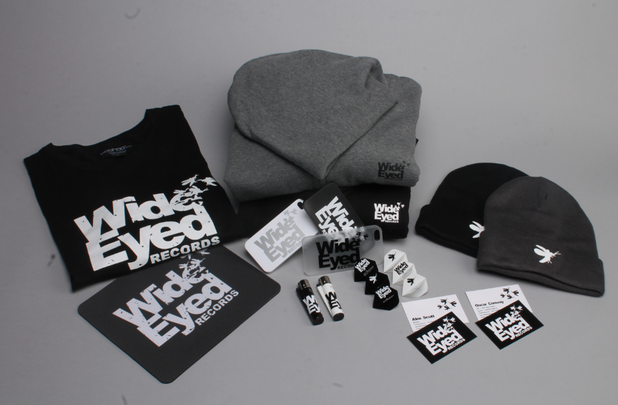
Photography
Photography.
After attending my portfolio review, I found that a lot of my photographs in my portfolio were quite low quality. This is something I already knew, and is something that I want to fix. Therefore for my Wide-Eyed branding brief I though not only will this look better for the client. As I will send them these images before they actually receive all of the merchandise. Also it will look so much better in my portfolio being photographed properly and well. This is something that I haven't done a lot before therefore having the photography staff close, helped me a lot.
Photography.


 Above are a few of the photos taken, and when I got back I realised that the lense must have had dust on it, as there are four large pieces of dust on each image. Although this is easily fixable.
Final Edited Photos.


I am really happy with the images taken, as is the client. I will definitely be using the photography studios for the rest of the briefs I will be doing throughout the year. And go back to photograph some of the briefs I have previously done and not photographed properly. From this experience I will remember to wipe the lense before starting next time.
After attending my portfolio review, I found that a lot of my photographs in my portfolio were quite low quality. This is something I already knew, and is something that I want to fix. Therefore for my Wide-Eyed branding brief I though not only will this look better for the client. As I will send them these images before they actually receive all of the merchandise. Also it will look so much better in my portfolio being photographed properly and well. This is something that I haven't done a lot before therefore having the photography staff close, helped me a lot.
Photography.
Final Edited Photos.
I am really happy with the images taken, as is the client. I will definitely be using the photography studios for the rest of the briefs I will be doing throughout the year. And go back to photograph some of the briefs I have previously done and not photographed properly. From this experience I will remember to wipe the lense before starting next time.
Subscribe to:
Posts (Atom)