Showing posts with label Yearbook. Show all posts
Showing posts with label Yearbook. Show all posts
Friday, 22 May 2015
Thursday, 12 March 2015
Year Book Pitch Evaluation
Evaluation.
The
collaborative for the year book came up at last minute as a few of us wanted to
do it but didn’t realise we needed more than two people, therefore Melissa
Hardcatsle, Amy Hill, Melissa Gater and I decided that we would do it, as we
all had ideas for it.
As a group
we started off really well with everyone coming up with some really good ideas,
and thoughts about what we will produce and the concepts for the yearbook. I
really like the idea of the showing the journey that we have all been on in the
least cheesy way possible, and showing that we have all made it out at the end.
This is something that everyone on the course can relate to and be a part of.
Injecting personality into the yearbook is really important, as well as our
yearbook pitch group, many other people said that it was important to them on
our course. Therefore there will be pictures of us a year group throughout the
publication. The strengths in this brief for me personally was the
collaborative itself, some people don’t like working in groups and like to make
it hard for others. So this is something I have learnt from doing this brief,
don’t work with friends, unless you know you work well together, and I have
learnt to have a lot of patience. Patience is important as you will not always
get to work with people who enjoy working in groups therefore learning to get
through briefs with people like this is crucial, as this may happen in the
future in design studios, and you have to learn to deal with people like that.
I think that in this brief we were successful at coming up with a strong
conceptual pitch, with the concept running throughout. The colour scheme worked
really well for this brief, as it is not gender biased, it is a popular colour
throughout the year group, which I think was a good decision made throughout
the brief also. Melissa H and I designed and made all of the typeface for the
presentation, as we thought that this would get the idea across better, whilst
Melissa G worked on how it would tie in with the end of year show, this worked
really well as we all individually had our own jobs to do to get more done, and
accentuate on peoples skills.
Although
we didn’t win the yearbook pitch there were other yearbooks up for grabs to
sign up to. Which I would have loved to be a part of but my group had fallen
apart by this point. If I were to do this brief again I would chose my
collaborative team more wisely, as I have found throughout the year I actually
really enjoy working collaboratively, there are more people to get ideas from,
and different skills to use. Therefore I have found people that I know work
really well together, and found people who really don’t. This will have been a
good thing that we didn’t win the yearbook, even though I would have really
like to have been able to put my name to a yearbook, it will not have been the
nicest environment to work in.
Wednesday, 11 February 2015
The Yearbook Pitch
The Presentation.
Unfortunately I wasn't able to access the presentation to put it on my blog as we put on a memory stick for the presentation, and it has been lost since then. Although all of the content for the presentation was on my second meeting post, apart from the mock ups for the end of year show produced by Melissa Gater. Although this is the running of the presentation which I had written so that everyone would have a better idea about what we needed to say and who was saying what. This was agreed by the whole group.
The presentation itself went really well, although there were a few things that we forgotten to be said it still went well. I think if we were to do this brief again, we would practice what we were going to say a bit more so that we didn't forget as many of the details that we needed to say to get a full idea of what the yearbook would be like.
Unfortunately I wasn't able to access the presentation to put it on my blog as we put on a memory stick for the presentation, and it has been lost since then. Although all of the content for the presentation was on my second meeting post, apart from the mock ups for the end of year show produced by Melissa Gater. Although this is the running of the presentation which I had written so that everyone would have a better idea about what we needed to say and who was saying what. This was agreed by the whole group.
(Concept)
Explaining the concept.
The mazes and what they mean.
(Alphabet Mazes)
The idea of the maze is consistent throughout the alphabet
and represents the course, but at the same time offers the opportunity to make
it personal to each student as its their own letter. The purpose of creating
the alphabet was to provide the possibility of everybody having an individual
line which represents their journey.
This will be shown at the front of the yearbook with a brief
explanation of the concept and meaning behind it.
Each person will fill out one of these puzzles.
Everyone will have a maze of their first initial.
Even people who have the same first initial can have
different journeys. Because there are several different outcomes to each maze
and each person will take their own journey through the course and make their
own decisions.
(Show Mel and Mel Mazes.)
(Then turn to next slide to show how we will digitalise it.)
We will digitalise each persons mazes so that it is personal
to them. Whilst making all the aesthetics similar, using the our colour scheme
which is this blue and will be explained later.
(Colour Scheme)
Has been popular through out year group.
It is gender neutral.
Matches the studio, which will make our application to the
end of year show more thorough.
(Layout)
Explaining the layout options and examples.
Where the name is on the side so when flicking through its
easier to see.
Having information down the side and right hand page mainly
image.
Giving each person the option to include one or two images
on the right hand page.
Explaining the break up pages… Showing exhibitions that we
have put on, guest lecturers and live briefs such as TDR, Ditto, SM, DBA, DR.
ME.
Die cut front cover.
(End of year show)
Because of the colour scheme the yearbook will work well
with the end of year show, as they are the colour of the studios.
Way finding on the floors using the blue vinyl colour as a
path through a maze, or maze on the floor.
Everyone’s individual mazes under their names in the
exhibition.
The 2015 front cover maze on the big white wall.
The presentation itself went really well, although there were a few things that we forgotten to be said it still went well. I think if we were to do this brief again, we would practice what we were going to say a bit more so that we didn't forget as many of the details that we needed to say to get a full idea of what the yearbook would be like.
Monday, 9 February 2015
Year Book Second Meeting
Year Book Progress - Second Meeting.
Before the Meeting.
Melissa Hardcastle and I decided that we would continue doing the rest of the alphabet mazes, this is so that they are all consistent, as ours both looked the same, also it would be better to show in the presentations exactly what we are talking about by showing them. Using Arial Black pt size 200, we both stated which letters and number we would do each so that the work was evenly distributed.
 This is something that I did after the first day, whilst Mel had some other letter at the other end of the alphabet. This is why we thought that we would finish them as it didn't take to long to complete between the two of us.


 After doing this we decided to send each other our numbers and letters so that we both had a full set and would be able to use them so experiment with a few different layouts. This is something else that we decided to do as a group, create different layout examples for the yearbook. This is so that we can show each other and decide on the next meet, also so that we can display them on our presentation.


 These are the different layouts that I have come up with. Thinking about what has been used in the past so that we can try to stay away from it, also looking at what worked really well and is needed in the yearbook. Some images are full bleed, although I am not sure how well that would work, but I thought that having some examples of this may work well.

 For our front cover of the year book we decided that we would use the maze numbers to create a cover that would look like all the mazes are brought together. Using the colour scheme that we decided on I thought that I would try to show this through the numbers to see what it would look like.
 On the inside of the front cover I thought that it would be good to include the mazes and a brief explanation of why the mazes have been use. This would give an introduction to the year book, but also give the readers a good idea of the concept also the previous yearbooks had an introduction into the reasons behind their concepts too.


 These are some of the layouts we have been discussing throughout the meeting today. We like the idea of having peoples names running across the bottom of the of the pages. With the information about the people at the top with their mazes. Also options for their layouts in the yearbook, and how many images and briefs need to be included in this for them.
 Also working on how we could present the idea of the maze concept in the pitch is important. We thought as we have two Melissa's in our group we would use an 'M' as an example, showing how people may have the same initials but everyone can chose their own journey throughout the course. Also showing how it will digitally created after everyone had filled in their own maze.
 I also decided to create a normal maze, this would be included in the end of year show, making it interactive and allowing people to do the maze them self. This will be mocked onto things by Melissa Gater, as she is producing the ephemera for the end of year show.
This was also another meeting that produced a lot of work, even with the obstacles faced during leadership in the group and some people giving more in put than others. Melissa Hardcastle and I decided that we would create the entire alphabet for the pitch as it will be a better way to show how it will work throughout the entire alphabet. Whilst we did this Melissa Gater started to think about making the concept stronger and linking it to the end of year show which is really important for the pitch to succeed.
Before the Meeting.
Melissa Hardcastle and I decided that we would continue doing the rest of the alphabet mazes, this is so that they are all consistent, as ours both looked the same, also it would be better to show in the presentations exactly what we are talking about by showing them. Using Arial Black pt size 200, we both stated which letters and number we would do each so that the work was evenly distributed.


This was also another meeting that produced a lot of work, even with the obstacles faced during leadership in the group and some people giving more in put than others. Melissa Hardcastle and I decided that we would create the entire alphabet for the pitch as it will be a better way to show how it will work throughout the entire alphabet. Whilst we did this Melissa Gater started to think about making the concept stronger and linking it to the end of year show which is really important for the pitch to succeed.
Friday, 6 February 2015
Year Book First Meeting
First Meeting.
Discussion Making.
For the first meeting I took the ideas that I had thought of for the year back, and what I thought that we could do with it. Also started to think about what was missing from the previous yearbooks, as I think that this is really important.
 Choosing to do the yearbook pitch for Graphic Design requires a lot of research. Looking at past year books to see what is missing from than and what worked well in them, learning from the past. There was no budget set, therefore started to think about using different finishes like die cut front covers. Also looking into how it can connect with the audience more and be more interactive. Research showed that the past year books weren’t very personal to each year, this is something that needs to be included.

 Ideas for the layouts are quite simple, including information about each person, their statement, the work that they have produced, including images, their achievements and experiences. The mazes concept will also run throughout, having each peoples maze at the top of their page. There will be four different layouts to choose from, which each person can pick which layout will be most appropriate for them, this will give people the opportunity to makes their pages look how they want them to look.
 We all decided that we would work on our own concepts, then bring them together to decide what we would do so that we cold have as many ideas as we could, to find the best one.
 This is a colour scheme that I thought of a long time ago, I think that the colours work really well together, and I have been waiting for a while to use it for something appropriate. The colour scheme came from how popular this colour has been throughout this year. This would allow the year book to link with level 6 Graphic Design. Not intentionally but the colour scheme also fits in with the Leeds College of Art decor and colour scheme. This would make the end of year show tie in with the year book as they would have the same colour scheme.
The Maze Concept.

 Working as a collaborative with Melissa Hardcastle, Melissa Gater and Amy Hill. The year book this year needs to have more personality than the other years, as they show off peoples work but not who they are as a person. The concept for the year book is that the course has been a puzzle/maze, and we all take different journeys but all find our way out at the end. This will be shown through mazes in letters. Each students first letter in their name is their letter, for example Melissa Gater and Melissa Hardcastle have the same name. Although this doesn’t mean that they took the same journey.
The Alphabet.


 We all decided on a way in which we will be producing the maze alphabet and that we would all produce one letter each so that we can show and example of how it would work throughout the yearbook. I decided that I would produce ABCD, just so that we had a few more to show, and so that I could see if it would work throughout different variants of letters.
For the next meeting we are all going to come back with more ideas about the layout that we are wanting to use and the letter that we have been given to produce. This meeting has gone really well, although there had been some heated disagreements with members of the group, we managed to get a lot done and have a good idea of where we are going with many decisions made such as the concept, colour scheme and thoughts about the layout.
Discussion Making.
For the first meeting I took the ideas that I had thought of for the year back, and what I thought that we could do with it. Also started to think about what was missing from the previous yearbooks, as I think that this is really important.
The Maze Concept.
The Alphabet.
For the next meeting we are all going to come back with more ideas about the layout that we are wanting to use and the letter that we have been given to produce. This meeting has gone really well, although there had been some heated disagreements with members of the group, we managed to get a lot done and have a good idea of where we are going with many decisions made such as the concept, colour scheme and thoughts about the layout.
Thursday, 5 February 2015
Yearbook Research
Yearbook.
Research.
Choosing to do the yearbook pitch for Graphic Design requires a lot of research. Especially working in a team with others, it is a god way to show your ideas to your group. I started by looking into publications and editorial, looking into what could be included in the yearbook pitch and what would set us aside from the other people pitching.
Examples.
This is an album cover for The Kooks which I find really interesting. I think something that is missing from the previous yearbooks is the personality, having photos of the people in our year on our course would help to put names to faces. Showing the people would be a good idea, this is on of the main things that I thought should be included in the yearbook, some personality.
The colours in this piece of information graphics work really well together, I think that they would be good colours to use. As well as the colours that work well I think that having some sort of information graphics in the yearbook could work well, having a bit of personality alongside information graphics could create a good balance between the two and work well.
 I also decided to look at some layouts for the yearbook, potential layouts that have been used before, although I think that having larger images would be a better idea, with less text.
Also I thought about the finishes that could be included, as the yearbooks budget is apparently quite high, and the printers can do many different finishes. Therefore having a a die cut from cover revealing the inside underneath could look really aesthetically pleasing.

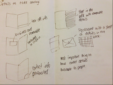
Something that I had never thought about before is packaging the yearbook, this could be something that separates ours from the rest. Using a good quality stock to form a publication package could work well, although this may be a waste of stock and materials, this is just a suggestion though.


Including something that works interactively rather than it being just plane will help the reader connect with the audience and with the yearbook itself. Again this is just an idea, although I don't think that it should be something like this example as it would be more suited to fine art than graphic design.

Again like the blue and black piece of information graphics the colours work really well together, the information graphics and the layout works really well. The aesthetics of this publication is what is so impressive, and it is works really well as a whole. This is what we need to go for when deciding on layouts and aesthetics of the year book for the pitch.

This is another example of how the finish of a die cut cover could work, and how to optimise the efficiency of it. Having a fold out cover could also work well.


I started to think about having a fold out in the publication, but I think that this wouldn't work very well for a large publication. I don't think that it would be very appropriate for a yearbook, although I think that it is something that I could use for another publication, as I think that the layout of it and the way that it works is really good.

The layout of this publication is so relevant to the year book that we are trying to go for. Having a images in the publication would make the year books more personal, but keeping a consistency of colour throughout is aesthetically pleasing. So with our colour scheme we could put a coloured opacity filter on them all so that they have the same aesthetic and colour throughout.


This publication is so personal, it includes lots of different pictures, although wouldn't show off the work very well. Although seeing things like this have influenced my idea of the year book. It has made me think about the different bindings and finished that could be used, rather than just applying a different layout.
All of these things are things that I am going to take to my group and discuss with them. This is so that even if the idea sounds silly at the time, it may lead someone else to thinking of something that will work really well for the year book pitch.
Research.
Choosing to do the yearbook pitch for Graphic Design requires a lot of research. Especially working in a team with others, it is a god way to show your ideas to your group. I started by looking into publications and editorial, looking into what could be included in the yearbook pitch and what would set us aside from the other people pitching.
Examples.
 |
| Source |
 |
| Source |

 |
| Source |
 |
| Source |
 |
| Source |
 |
| Source |
 |
| Source |
 |
| Source |
 |
| Source |
 |
| Source |
All of these things are things that I am going to take to my group and discuss with them. This is so that even if the idea sounds silly at the time, it may lead someone else to thinking of something that will work really well for the year book pitch.
Subscribe to:
Posts (Atom)