Showing posts with label Tiger Print. Show all posts
Showing posts with label Tiger Print. Show all posts
Thursday, 21 May 2015
Wednesday, 21 January 2015
Tiger Print Evaluation
Evaluation.
I
decided to do the Tiger Print brief, as I have previously done it before for a Valentines
Day card brief, but I didn’t like what I produced, therefore I decided that I
would do another one, and not settle for anything less than something that I
like and think it appropriate and well produced. Trying to get people to look
at Christmas in a different way, moving away from the materialistic presents
and trying to make the holiday more personal and nostalgic. Focussing on the
natural side of Christmas, for example a snowy scene or an open fire.
I
am a lot happier with these Tiger Print submissions than any others that I have
produced in the past for other competitions. I have learnt that I should only
submit things into competitions that I actually am proud of and would put my
name to. There are two patterns that I like more than the other two, and I am
really proud of that them. This is my first competition brief completed this
year, and although I only planned to spend a day on it, I found that coming
back to it a few days later meant I could have a fresh look at it and change
what I didn't like about it. If I were to do this brief again I would have
maybe produce more variety of patterns, rather than three different snowmen and
one tree pattern. Overall I am happy with the prints I have produced. And I
think that making them into actual gift-wrap and bags and tags enhances the
effectiveness of the design.
What
I have learnt during this brief is that although sometimes it is appropriate to
make mock ups, in this case the designs are more aesthetically pleasing when
they are printed and made. This is something that I will always do in the
future, make sure that I only use mock ups when appropriate.
Tuesday, 20 January 2015
Chirstmas Gift Wrap Photography
Tiger Print Gift Wrap.
Photography.
For the tiger print brief I decided that I would just mock up each of the wrapping paper that I designed onto gift bags and tags, this meant that I didn't need to have them printed or make them myself, this would save me lots of time. Also because the brief was to create a surface pattern I didn't think that it would be appropriate to create the gift wrap itself. Although after creating my design boards, I found that it doesn't do justice to the gift wrap itself. Therefore I decided that I would chose my favourite surface pattern and create gift wrap, gift bags and tags, and photograph them for this brief. I will also include on one of my boards a range of all of the different surface patterns I made and that they would all work in this way.


 At first I thought that it would be a waste of time to make and photograph these surface patterns, when I could just mock them up. But I think that after I have done it, it was really worth it as it looks so much better than the mock ups that I produced. Although I don't think that it is necessary to creating the gift sets for all of the patterns, just one to show in an example.
Photography.
For the tiger print brief I decided that I would just mock up each of the wrapping paper that I designed onto gift bags and tags, this meant that I didn't need to have them printed or make them myself, this would save me lots of time. Also because the brief was to create a surface pattern I didn't think that it would be appropriate to create the gift wrap itself. Although after creating my design boards, I found that it doesn't do justice to the gift wrap itself. Therefore I decided that I would chose my favourite surface pattern and create gift wrap, gift bags and tags, and photograph them for this brief. I will also include on one of my boards a range of all of the different surface patterns I made and that they would all work in this way.


Wednesday, 10 December 2014


Wednesday, 12 November 2014
Plan So Far.
Thoughts.
So far during level 6 I have many different briefs on the go. The first brief I started was '100 days of..' this is quite a large brief but has a large time scale so doesn't take up too much time to create 1 monster a day, as long as I keep on top of it, which I have done so far, this is somthing I will be using for my Context of Practice practical. I also started my Quentin Tarantino Boxset at the start of the year too. After starting these briefs I then received two different live briefs that need to be done to a deadline, one of which is quite small(Christmas Sushi), the other being quite large(Wide-Eyed Records). To take a break from the others I entered a competition brief for Tigerprint, this was quite a small brief and didn't take up too much time, but gave me a break from my others. As well as that me and my collaborative partner have started our collaborative brief (Pops), I also have tutorials breaking up the week for CoP, this is really important so I need to prioritize this especially as the essay deadline for our draft is on 11th December. Also we are being set different live briefs throughout the year, and although we don't have to do them, I think that it would be best if I did, as it would be doing different kinds of things and doing it for an actual design studio.
Plan.
I think I am spreading my time to thin and I should prioritize certain briefs before others. Some which have a deadline sooner and that are live should be done sooner.
- Continue doing the '100 days of' as this is not largely time consuming, it also gives me something to keep focused on an up to date with everyday, and at the end I will have a large amount of illustrations.
- Put the Boxset to the side as there is no immediate deadline and I can pick it back up after a few live briefs are done and my CoP is more on its way. I think this is something to pick back up when I break for Christmas.
- Tigerprint has been finished and submitted, it has been blogged and finished, the only thing left to do is mock onto things and create design boards for it, this is something I will do closer to the 11th Dec.
- Wide-Eyed Records is a live brief and is something that needs to be completed before the 20th Nov, therefore I will prioritize this. I will also split this brief into two as the branding and logo needs to be completed before the 20th, and the posters for later in January.
- Christmas Sushi, this is a brief that won't take up too much time, and will be a nice break for me in the longer briefs. This is also a live brief which means that I will be able to get feedback from it for doing it.
- CoP is really the most important thing to me right now, it is something I am going to set days aside for each week so that I can always have time for it. This is specific for my theory part as it is something that I struggle with, my practical is consistent and it will be done over a course of 100 days, and then more to develop the campaign.
- My collaboration with Adam hasn't got very far so far. There hasn't been a lot of communication with each other and we have only just established what the brief actually is. After my two live briefs are completed I will be able to focus more on the collaborative, starting ideas and designing on the 23rd Nov, as I should have both my Christmas Sushi and Wide-Eyed Records part one done by then.
Monday, 10 November 2014
Christmas Pattern Development - Tigerprint
Further Development.
Coming back to my Christmas patterns a few days later has allowed me to see that I am not too happy with the current prints I have produced and I want to make them slightly more interesting, and more likely to be produced for M&S.
 When approaching the classic snowman look originally I think I got it wrong and made it look a little bit tacky instead. Producing a single snowman, and instead of creating a scene, this would be going on the character design, which is something I prefer.
 When putting it in a repeated pattern I have found that it works really well, it looks so much more elegant and it will fit in so much more in Marks and Spencers. I will be happier submitting this design over all the other that I have tried so far.

 Trying out something different to try and stand out from the rest is something that think might work. I think that this will relate more to children. Experimenting with cutting out and shrinking some parts of the snowman gave this effect. It turned that it worked really well and think that it could be a very good as a repeated pattern.

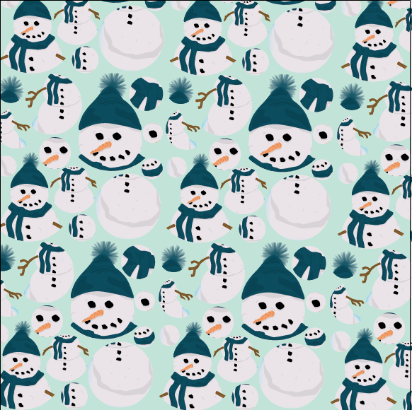


 This pattern works really well as a repeated pattern, because of the individual tile and the layout of it, it makes the pattern less blocky, which creates consistency through the repeat pattern. This s a better way of working, especially as it will be used as wrapping paper and gift sets, which means that it needs to be quite consistent, not too blocked out. Screenshots of lots of different trials using different colours just shows how diverse the print is, and how it will work really well like this in any colour.
 After creating a more consistent pattern, I thought that maybe adding something to the single snowman to create something that flows better. Even though it might not make sense, it is aesthetically pleasing, which is all it needs to be for a wrapping paper.

 After creating patterns that are slightly alternative I experimented further using colours and shapes to make them stand out amongst the rest. These patterns don't work very well, even though they are using Christmas colours, they look really tacky and definitely wouldn't fit in with the current Marks and Spencers.

 I had a small informal crit about the designs that I would be submitting for the Tigerprint brief, and the feedback I received was that the snowmen circles work best for M&S followed by the single snowmen and the broken up snowmen. There were also comments made about the trees and how people liked the trees just not with those colours or backgrounds, putting them on a less harsh background colour allows them to look better, therefore I have been told to also submit this one. I won't be submitting any designs that I don't like just becasue there is five entries.
Final Patterns.


 I am a lot happier with these Tigerprint submissions than any others that I have produced in the past for other competitions. I have learnt that I should only submit things into competitions that I actually am proud of and would put my name to. There is one pattern that I like more than the other three, and I am really proud of that one. This is my first competition brief completed this year, and although I only planned to spend a day on it, I found that coming back to it a few days later meant I could have a fresh look at it and change what I didn't like about it. If I were do do this brief again I would have maybe produce more variety of patterns, rather than three different snowmen and one tree pattern. Overall I am happy with the prints I have produced, especially the first one. After doing this I will try to present them in a more appropriate way, and could try to mock them onto something to make the patterns real.
Coming back to my Christmas patterns a few days later has allowed me to see that I am not too happy with the current prints I have produced and I want to make them slightly more interesting, and more likely to be produced for M&S.
Final Patterns.
Sunday, 9 November 2014
Christmas Pattern - Tigerprint
Tigerprint.
The Brief.
This month the competition is all about designing Christmas wrap.
We would like you to consider what makes a great allover repeat pattern for Christmas wrapping paper. Is it a traditional foliage pattern, a cute character, a scene or photographic?
Play to your strengths as a designer and enjoy playing with scale, colour and repeats. Consider how your wrap will look on a roll and how a gift will look when wrapped in your design.
Look out for inspirational posts to help you on our blog over the coming weeks. We can't wait to see your festive designs!
Initial Thoughts.
I have previously entered a few Tigerprint competitions, and I haven't been very proud of any of the submissions I have done, and just did them so that I could complete a competition brief, and have more experience with them. With this brief I am only going to submit the patterns I am proud of, and think could win, or something that I would wan to put my name to.
I started to think about Christmas and what I think about Christmas. A lot of Christmas products recently are about presents and sweets e.t.c. With this brief I decided I want to go back to what I think Christmas should really be about, the natural joy, not simply about monetary goods and material things. This has lead me to think about the outdoors and the snow and the iconic snowman. This is something I want to explore with this brief, snowmen and the outdoors.
Also every Tigerprint brief advises you to look into current designs used in Marks & Spensers, this is becasue this is where most of their designs are. This is something in the previous competition briefs I have just ignored and thought that I wouldn't need to research into as it is such a short brief, but this time I will definitely be finding some current M&S designs.
Development.
(insert image of different layouts)
In the brief it states that the pattern could explore, colours, shapes, characters and scenes, therefore I thought I would start by looking into different Christmas scenes and draw out a few different ideas. Going with the ideas of an outdoors scene and characters I thought that I would start digitally creating a snowman.
 With this illustration I have tried to make it quite detailed to add dimension to the snowmen as this is the style in which I like to design. I also think that it will be more appropriate for M&S. A lot of the illustrations that are really simple with no detail on them that I have tried look really tacky and childlike. This is something that I am trying to avoid doing with this brief, this is why I am adding more detail.


 I tried a few different layouts for them to be in, including different amounts of snowflakes. I think that having snowflakes makes the print look less blocky and more like a pattern that flows. I am happy with this, and think that it is better than the other submissions I have made for Tigerprint.

 Instead of submitting lots of different variations and layouts of the same thing, I think that having another outdoor scene would work well, so I decided to create trees, like a woodland area. I did this by creating a symbol on illustrator and spraying a tree. Adding snow gives the effect of Christmas in my opinion.


 Adding snowflakes to the background gave the print a better effect in my opinion. I also thought that it could be interesting to put the two illustrations together. Although I still think that there is still something missing, maybe need to try and ass some colours, or make the scene a night time scene.
Colour Experiments.


 I think that these layouts work so much better with a colour behind them, it makes it look more interesting/less boring. The dark blue looks like its night and the light blue looks like the daytime, even though snow is white, sometimes the colour used is blue.
Alternative layouts and illustrations.


 I have decided to create a scene with both the snowman and snowy trees in the pattern. This is so that it would like an outdoor scene. I prefer this illustration using the lighter blue as the background than the singular illustrations of the trees and the snowmen. Although I think that the wrapping paper pattern is still quite standard. To me they are still quite boring, and the last one is the only one that I would be happy to submit right now. I need to consider the audience a bit more and make something that is less ordinary and not something that has been seen before.
The Brief.
This month the competition is all about designing Christmas wrap.
We would like you to consider what makes a great allover repeat pattern for Christmas wrapping paper. Is it a traditional foliage pattern, a cute character, a scene or photographic?
Play to your strengths as a designer and enjoy playing with scale, colour and repeats. Consider how your wrap will look on a roll and how a gift will look when wrapped in your design.
Look out for inspirational posts to help you on our blog over the coming weeks. We can't wait to see your festive designs!
Initial Thoughts.
I have previously entered a few Tigerprint competitions, and I haven't been very proud of any of the submissions I have done, and just did them so that I could complete a competition brief, and have more experience with them. With this brief I am only going to submit the patterns I am proud of, and think could win, or something that I would wan to put my name to.
I started to think about Christmas and what I think about Christmas. A lot of Christmas products recently are about presents and sweets e.t.c. With this brief I decided I want to go back to what I think Christmas should really be about, the natural joy, not simply about monetary goods and material things. This has lead me to think about the outdoors and the snow and the iconic snowman. This is something I want to explore with this brief, snowmen and the outdoors.
Also every Tigerprint brief advises you to look into current designs used in Marks & Spensers, this is becasue this is where most of their designs are. This is something in the previous competition briefs I have just ignored and thought that I wouldn't need to research into as it is such a short brief, but this time I will definitely be finding some current M&S designs.
Development.
(insert image of different layouts)
In the brief it states that the pattern could explore, colours, shapes, characters and scenes, therefore I thought I would start by looking into different Christmas scenes and draw out a few different ideas. Going with the ideas of an outdoors scene and characters I thought that I would start digitally creating a snowman.
Colour Experiments.
Alternative layouts and illustrations.
Subscribe to:
Posts (Atom)