Showing posts with label Brief 14. Show all posts

Wednesday, 20 May 2015

Adnams Beer Evaluation

Evaluation.

I decided to do a re- brand of a range of beers found in the supermarket, whilst doing this I decided to go and look in all of the supermarkets to find which beer to use. I chose Adnams because when it is on the shelves it is clear that the brand wants to stand out, and be colourful in its approach. Although it is colourful, using the logo the way that it had and the colours that they used makes the beers look slightly garish and stand out for the wrong reasons.

When starting this brief it was important to know the history of the brand, this is because their packaging reflects this a lot, and it is something that is important for them to include in the branding and the packaging. One of my strengths in this brief is showing the history of the brand through the illustrations used on the packaging, also keeping the labels as realistic as possible by using all of the exact same information on each bottle as their original bottle. This will show that it would look exactly like this if it were to be re-branded, with all of the information that Adnams want to include in their beers. The beers look very realistic and look like they would work well on the shelves. If I had more time on this brief I would have produced the gift set packaging to go with it, so that it could work as a gift as well as individual bottles. Although for this brief it was not relevant as the brief was to make them look better in supermarkets, and the gift packs aren’t sold in supermarkets.

I also think that if I were to do this brief again, I would allow time for further production and making more of the bottles so that I could photograph them in a supermarket for my design boards, as I think that this would be more effective, ad give a better idea of how they would look as a range in a supermarket. I tried to do this with just the three I had but wasn’t able to get permission, therefore if I had more time I could have travelled to different supermarkets to get photos in situe. Overall I am really happy with this brief, I think that the packaging is aesthetically pleasing and will attract more attention on a shelf than they did before, but for good reasons.

Tuesday, 19 May 2015

Adnams Beer Photography

Adnams Beer.
Photography.
For the Adnams Beer brief, the brief was to make the packaging for the beer more appealing in supermarkets. From this I thought that I would expand it so that I would make the brand as a whole more appealing by doing re-branding and packaging for the beer, but also re packaging the beer gift set. Although the brief initially entails re branding and packaging the beer bottles themselves to be more appealing in supermarkets. Therefore it wouldn't be appropriate to make a gift set as this wouldn't be sold in the supermarkets anyway, just on the Adnams website.


Overall.
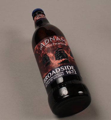
Photographing all of the Adnams beers was harder than I thought that it would be. The lights were hard to manage as all the beers are bottle, therefore the light reflected off these. Also I found that having the bottles lying down made the images and the labels easier to see. Trying to include the beers in situe, for example being bought from a supermarket was quite hard to do, and didn't show the packaging design very well. Therefore to get these photographed in situe would mean me having to get pictures in a super market which I wouldn't be allowed to do. Overall I think that the photography went well and there are a few that show off the beers really well.

Monday, 11 May 2015

Adnams Label Development

Adnams.
Development.
For this brief I will be re branding and making the packaging and labels for the Adnams beers that are available in supermarkets. Also after looking further into the brand and what works well for sales in supermarkets, I am also going to be creating a gift pack for the three main beers that are sold in store. This includes three beers and a pint glass;
Source
This will be the gift pack that I will be re-branding. I think that making a gift box gives the customers a more luxurious feel to the pack and the purchase. It will also make the recipient of the gift feel like the gift is more luxurious. I think that it is important to re work the logo to make the packaging stand out more without being too garish as I think it may be seen now.

The Logo.

Using the original logo and applying different colours to it. Although the logo used on the labels and packing currently are the original logo in a dark blue on a banner/flag, which looks a bit tacky and the colours are quite garish using them together.

Layouts.
Trying to keep the general aesthetic of the labels the same so that they are recognised, but trying to make them more appealing to their audience is very important for the re-brand of these labels.

Using slight details on the boats will allow them to have slightly more depth and I think that this is something that is missing from the current labels, having them slightly 2 dimensional makes them not stand out a lot on the shelf, which is something I am going to try and avoid, to make them stand out on the shelves.

Trying out different colour variations to see which will work more to get the labels to stand out on the shelf. Something that I have found about the original bottles is that they are quite dark in the colour use, therefore I don't think that this would work, I think that they should be slightly darker whilst more aesthetically pleasing.

Going for a different effect with a coloured smoke like effect as the background colour rather that having a water coloured effect in the background. I think that this is more appropriate for the labels and having the water illustrations under the ship gives the allusion that it is on the water.

Trying to make the ship stand out more on the red smoke background by placing a lighter red with a glow on the ship did not work, it made it look slightly tacky. Also making the type white makes it clearer, it also brings out the ship on the label.
To make the type stand out more, and make sure that it is legible by putting a blue banner on the bottom of the labels bring the original brand colours back into the labels so that they can link to the bottle caps. This is really important and works really well. It will also create another link of consistency throughout the brand and make the link between the three different bottles stronger.

Keeping consistency throughout the three different beers by simply changing the colours, ships, and the information. They work individually and work as a set. I think that it works so much better with three ships on each of the labels, it boosts the idea of it being on the water using the ships.

Back Label.
For the labels for the back of the I decided that to keep them authentic and like they would actually be on the shelves, I would include all of the same information as there is on the current labels, including all of the health information and ingredients.


After creating the front and back label I realised that the colours didn't exactly match the original colours in the labels in the current bottles. Therefore I decided to make a colour match to the current packaging and make them slightly brighter, this is so that they stand out more on the shelves, also so that they are lifted from the bottles slightly more. This is because the bottles are very dark.

Overall I think that the label designs work really well and that they are so much more aesthetically pleasing than the current Adnams beers. This is something that works well as a set, but also work well on their own, therefore if some supermarkets don't have all of the beers they would still work on their own.