DVD Packaging Covers.
After starting to illustrate Pulp Fiction scenes and Kill Bill scenes I found that I need to think about the layout and overall aesthetic of the box set itself. I have decided what kind of packaging I am going to use for the box set, so it would just be the layouts and aesthetic that I am going to use.
I decided to use Pulp Fiction as an example for the layouts, as it is my favourite Tarantino film, and it is the film I know most about. Considering using film quotes on the inside and illustrations, representing a comic strip type effect as that is something that Tarantino is really into.
I think that having a zoomed in version of the illustration on the cover might work well, experimenting with the different uses of type. Such as maybe not including the film title at all on the front cover.
Digital Experiments.
I have decided to move digitally for now as it is easier to experiment with the different layouts to see how they would look using the different illustrations that I have already created. I have decided to experiment with different layouts and colours, trying to fins a colour scheme.
After trying a few layouts I decided that I need to initially find a colour palette to use throughout the box set. This is something that is really important and it will send a message through the colours.
Going through the different colour schemes that I am considering were all brought from what I consider represent Quentin Tarantino. I have noticed that a lot of Tarantino films have the colour red, this represents violence, danger and power which I think Tarantino films show.
Cover Layouts.
Trying out different layouts for the Pulp Fiction cover meant that I could see what it would actually look like rather than just drawing up thumbnails. The type on the cover looks awful in my opinion, I also think that its not necessary to have the title, as the illustrations should be enought to establish which film it is.
Testing out some of the colours from the colour scheme I have chosen on the background of the cover to see if it will make a difference. I prefer it on the black, it looks more classic and Tarantino, and less tacky and desperate.
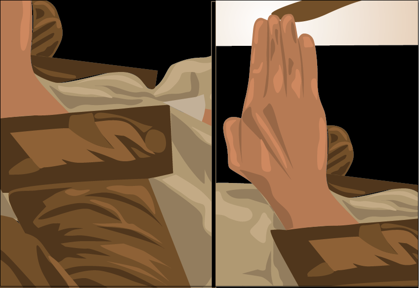
I know that I want to have the close ups of the most well known or most memorable scenes in the film, but there are many different layouts that I could choose from, its just finding the one that works best for each film.
I also started to look at Kill Bill Vol. 2 where the most iconic moment was when she was breaking out of the coffin when she was burried alive. I really like the close up on the hand, arm and body shot, although I'm not sure about the other, I don't want to use the same image twice, I also want to use a detailed vector image. For this one I think that I will create another illustration, maybe of the knife in the boots in this scene.


No comments:
Post a Comment