Further Development.
Coming back to my Christmas patterns a few days later has allowed me to see that I am not too happy with the current prints I have produced and I want to make them slightly more interesting, and more likely to be produced for M&S.
When approaching the classic snowman look originally I think I got it wrong and made it look a little bit tacky instead. Producing a single snowman, and instead of creating a scene, this would be going on the character design, which is something I prefer.
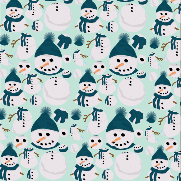
When putting it in a repeated pattern I have found that it works really well, it looks so much more elegant and it will fit in so much more in Marks and Spencers. I will be happier submitting this design over all the other that I have tried so far.
Trying out something different to try and stand out from the rest is something that think might work. I think that this will relate more to children. Experimenting with cutting out and shrinking some parts of the snowman gave this effect. It turned that it worked really well and think that it could be a very good as a repeated pattern.
This pattern works really well as a repeated pattern, because of the individual tile and the layout of it, it makes the pattern less blocky, which creates consistency through the repeat pattern. This s a better way of working, especially as it will be used as wrapping paper and gift sets, which means that it needs to be quite consistent, not too blocked out. Screenshots of lots of different trials using different colours just shows how diverse the print is, and how it will work really well like this in any colour.
After creating a more consistent pattern, I thought that maybe adding something to the single snowman to create something that flows better. Even though it might not make sense, it is aesthetically pleasing, which is all it needs to be for a wrapping paper.
After creating patterns that are slightly alternative I experimented further using colours and shapes to make them stand out amongst the rest. These patterns don't work very well, even though they are using Christmas colours, they look really tacky and definitely wouldn't fit in with the current Marks and Spencers.
I had a small informal crit about the designs that I would be submitting for the Tigerprint brief, and the feedback I received was that the snowmen circles work best for M&S followed by the single snowmen and the broken up snowmen. There were also comments made about the trees and how people liked the trees just not with those colours or backgrounds, putting them on a less harsh background colour allows them to look better, therefore I have been told to also submit this one. I won't be submitting any designs that I don't like just becasue there is five entries.
Final Patterns.
I am a lot happier with these Tigerprint submissions than any others that I have produced in the past for other competitions. I have learnt that I should only submit things into competitions that I actually am proud of and would put my name to. There is one pattern that I like more than the other three, and I am really proud of that one. This is my first competition brief completed this year, and although I only planned to spend a day on it, I found that coming back to it a few days later meant I could have a fresh look at it and change what I didn't like about it. If I were do do this brief again I would have maybe produce more variety of patterns, rather than three different snowmen and one tree pattern. Overall I am happy with the prints I have produced, especially the first one. After doing this I will try to present them in a more appropriate way, and could try to mock them onto something to make the patterns real.


No comments:
Post a Comment