Discussion.
After speaking to the client briefly I found that he would prefer to use an animal such as a firefly instead of leaves in the logo. This would work better as an illustration on its own too so it could work well, this is something that I will try straight away. He also sent me a few different typefaces to try, although non of them were commercial typefaces so can't be used anyway, but it means I will be able to find something similar, or try to create something similar myself.
Fading Logo.
This is the image of the firefly which the client found to send me, I re-drew it in a vector form as it will work better in the logo this way.
When applying it to the logo I decided to change the sizes of the firefly as it is coming out of the type, this makes it seem more real. I prefer the fireflies to the leaves, they are more interesting. Also the name 'Wide-eyed' makes people think of drugs (sometimes) this isn't something that is wanting to come across with the logo, not the message this brand it trying to say. The leafs in the previous logo, some have said look like cannabis leafs. This is something I am wanting to stay away from, why the fireflies work so much better.
The client was worried that the firefly may not look like a firefly and might just look like a mosquito or some kind of random insect, this is why I have tried to recreate the glow in the tail through negative space. In my opinion the original looks better but this is an alternative if it does look too much like a random insect.
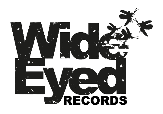
Hand Drawn Type Logo.
From the typefaces the client sent me to look at I had a feeling that he was looking for a hand drawn type that isn't perfect but still being block and bold. Therefore using Arial Black as a template I drew around it trying to make it not completely perfect whilst still allowing it to look hand drawn.
I have decided to add the fireflies to this so that they can be involved in the logo but can also be used separately too. A recent email from the client asking if I would be able to include the word 'Records' in the logo, just seeing if it makes any difference, and seeing whether it could be done. Trying it on both logos, in the best way I think it will work on each.
After mocking up 'Records on each logo, I decided to take these two logos into a mini crit, to which the response was that:
- The second logo works better and is more appropriate for an underground house music record company.
- The top looks like it could work as a record company, but not necessarily for house music.
- The bottom logo is more original and memorable.
- Could make the top logo with the fill of the bottom.
After receiving this feedback I decided to take the bottom logo further, although I will be showing the client both to see which he prefers. But by moving on with the bottom logo, I decided to make the word 'Records" out of fireflies too, in both upper and lower case, to see which looks best.
Lower case looks better as the type in the logo is lower case too. Although again I will let the client decide and hear his thoughts before moving forward with anything.


No comments:
Post a Comment