Wide-Eyed Research.
I have decided that to get a better understanding of the kind of aesthetic I am going to produce I have decided to research further into underground house music, and the labels and branding that is already outs there. Even though I like to think that I know a bit about it, relative to the client I know nothing, therefore he has given me some different things to look into, the kind of ideas and aesthetics he likes in a brand.
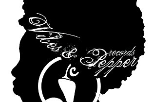
Vibes and Pepper.
What I like about this identity is that it is quite minimal whilst showing lots of detail, it does this using the negative space and minimal colours. I think that the type works really well with the image, the script font is what makes it works so well.
What I like the most about the Vibes and Pepper logo is that it is so recognisable. The pepper image within the image and logo itself works on its own as well as in the logo. This is something that I wish to achieve within the design for Wide-Eyed Records, having a logo and an illustration or image that works with it, but also works just as well on its own.
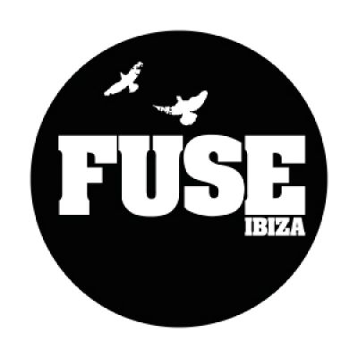
Fuse.
Fuse is another prime example of being able to use both the type as the logo and the birds themselves. I also think that this is quite interesting as Wide-Eyed will be music brought from both Ibiza and Verbier, as Fuse is based in both London and Ibiza. This shows a way that you can demonstrate having something like this in two different places.
As well as having the birds being able to work on their own, they also sometime use different layouts with the type and image when it comes to different formats. This works so well and is a prime example of what the client is looking to have, something that will work interchangeably as a logo. Also if people saw the birds on their own and knew about Fuse, they would instantly recognise the brand, whereas if someone else saw the birds without the type, they wouldn't know what they are about. This is the idea that I get when the client says that the brand is for people who are aware of them and the underground house industry, not just for everyone.
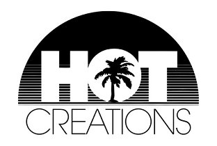
Hot Creations.
Again with Hot Creations the image in the logo and the logo itself works separately. Looking through the first three brands that the client likes I have found why he likes them as they all do a similar thing, and from the brief I have been given it makes sense. Even though he might not have known why he has chosen these brands, I have found very similar things throughout, this is something I am going to try and do with Wide-Eyed.
The logo is black and negative space, this means that it will work in black or white, also can work on coloured backgrounds which is important with music oriented brands, as the event posters and promotional materials are usually quite colourful. This is something I will also bare in mind when it comes to designing the logo and branding for Wide-Eyed.


No comments:
Post a Comment