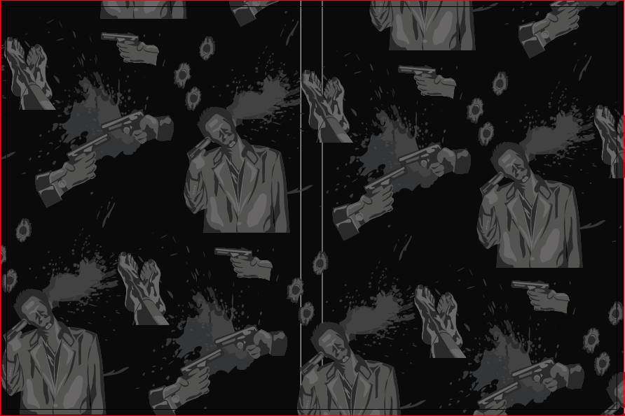
The Inside Pattern.
For the inside of the DVD cases I would like to have a pattern. Having type or anything with words makes the viewer really struggle to read it through the plastic DVD tray. This is something I don't want to encourage. Also having some sort of story or full colour illustrations on the inside will just mean the same thing, that people will try to see it and struggle. I would like to include a pattern on the inside, something that is quite detailed in the images, although grey scale on a black background with an opacity so that it is more faint and subtle.
I have started by using some of the illustrations that I have previously done of Quentin Tarantino. I think that it is important to have quite a busy background, with no colour but lots of detail in the illustrations. This will show through the plastic DVD trays, and will still fit in with the style of the box set. There should be violence in the illustrations as Tarantino films are quite violent.
I also wanted to include the feet from the Death Proof cover. This is simply because a lot of Tarantino films include bare feet, and have close up shots of bare feet. The feet in this illustration are also quite laid back and chilled, this is something else that is present in his films. It is showing that people in the films are relaxed and used to all of the violence, and just sit back and watch. Also showing others being entertained. Tarantino has a thing about feet, this is crucial to him as a director and writer, this is why I wanted to use them.
Layouts.
With the layouts of the pattern, I wanted it to be quite fluid, whereas this is very stiff and gridded. This is not what I was going for when I was thinking about a pattern.
This pattern is slightly better, as I have moved around a few of the different images to make the pattern look more natural, although I think that the feet need moving up slightly to fill the gap.
The pattern looks a lot better moving the feet up into the space slightly more than it was before and re-arranging the images that I drew. I decided that I would put a black opacity over it so that was less harsh, and blended in more, so that the pattern will be subtle rather than being overwhelming. I tried a few different opacities before coming to 30%, this is so that it makes it less harsh but not too dark. As it will be sat behind a clear DVD tray, therefore it will be less harsh anyway, so can't be too dark otherwise it wont be visible at all. This design will fit with all of the films as they all include bare feet, Tarantino, violence and blood.


No comments:
Post a Comment