The Publication.
The Content.
Inside the publication I am wanting to include information about the films that are in the box set, information about Tarantino and the films that he has directed and written and the trade mark things that he does in them, also trivia about him as a person and film maker. I also want to include some information graphics about the films, and something that will link all of the films together.
Information Graphics.
The * sign is used to blank out swear words, therefore creating an info graphic about how many times different swear words are used in Tarantino films, this glyph would be appropriate to use. I thought about using as many glyphs as there are swear F bombs in the information graphics, but as there is such a range of the amounts used, I think that it would be better to use a type based info graphic.
I started to think about how it would work, and how I would show how many there were and which films had the most. Therefore thought that I would use the numbers, whilst also making the larger numbers larger to show clearly how much more it was than others.
I also started to think about using the glyphs as a mask of the numbers,
this will add detail to the info graphic and make it more aesthetically
pleasing. As well as this I started to think about the colour scheme that I have decided on, although I think that it looks too garish and event thought the colours are appropriate for Tarantino and the films that he has produced, they don't work very well within the information graphic. I will move onto the next info graphic and decide what I am going to do for that, then I can think about the colours that I am going to use and what will be appropriate for them all.
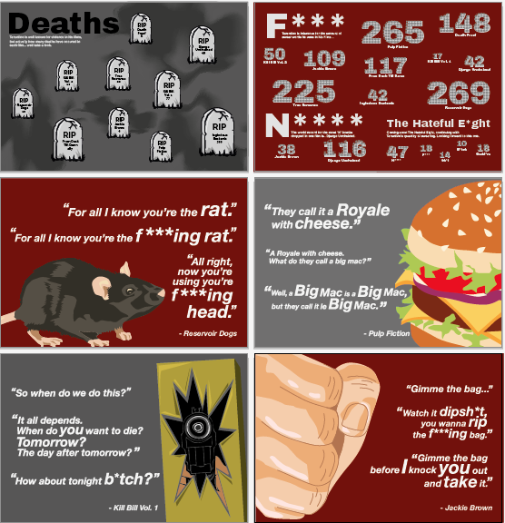
I also decided that I would work on an info graphic for the amount of deaths in Tarantino films, this is becasue I think that it will relevant to the films as they are quite violent films. Also I found a lot of information about the deaths in the film and how everyone was killed, therefore this wouldbe very effective in the publication.
Similar to the swearing info graphic, I have made the headstone larger for the amount of deaths in the film. This will keep the info graphics consistent throughout the publication. But again I don't like the colours used, I think that I need to look further into the colour scheme throughout the publication to see what is most effective.
Moving back onto the first info graphic, I have found that red works quite well with white and grey. It stands out amongst the background and the information just out at your which is what I was going for with the information. Also the red does go with the colour scheme that I was using originally. Although I still think that the colour scheme needs a lot of work, this works well for these statistics.
Images and film quotes.
For some of the films I think that having some memorable quotes and scenes would work well in the publication to split up some of the pages about the films, as currently they are quite blocky. The royale with cheese quite is one of the most memorable scenes in pulp fiction. Using a cheese burger illustration to support the quote will engage the audience further.
I have done the same thing for a few more films, one of the being Jakie Brown, illustrating it with a fist to show people punching.
Similar to the others, the Kill Bill Vol. 1 and Reservoir Dogs have their quote supported by an illustration to create something that is effective. Whilst doing this I found that using greys instead of browns in the graveyard info graphic works so much better. It creates a darker and gloomier effect and also makes the colour scheme for this go with the rest of the publication.
Having all of the illustrations and info graphics together shows how much they work as a set. These will go really well in the publication. Dividing the pages of the films using double page spreads will give the publication more substance whilst creating something interesting to look at throughout.
Moving on from this I will be printing the publication and preferably perfect binding it, this is so that it would fit in well with the boxset. The publication is the size of one of the DVD cases, therefore I can bare this in mind whilst making my box set. I hope that the colour prints well within the publication and works well with the colours used in the box set its self.


No comments:
Post a Comment