Meeting 2.
During our second meeting, Mel and I decided that we would work on the logo together, trying to play with the ideas of spilt milk. We are spending the meeting working on the logo and the aesthetic of the brand itself, including the colour schemes and typefaces used.
Logo Development.
I started to think about the notion of actual spilt milk. Using a platter of milkas the colour and the Spilt Milk as a white negative in the middle, this makes the name stand out and the logo quite noticeable. Although after doing this and looking into milkshake brands, we found that it is exactly like the shmoo milkshakes. There we need to move away from this idea.
Playing with the idea of smoke and making it look like drops of flavour infusing with the milk, creating a milkshake. This is a good idea and concept for the milk shake shop as we are aiming to create a trustworthy brand that shows spilt milk. Although with this logo it seems to be a bit too serious. The Milkshake shop needs to show something that is fun but not too over the top and cheesy. And this logo isn't very fun, it is too serious for the milkshake shop.
This idea of making the logo so that it could look like spilling milk into the shape of the letters could look really impressive. Although these are all quite rushed and they don't look as much like spilling milk as they could. I think that this idea works quite well with the brand, it makes the Milk Shake logo quite simple but fun at the same time.
Trying to do something slightly more simple with it, so that it looks like it is spilt milk, but not too cheesy and obvious. Although this doesn't look good enough yet, I think that it needs to be either simple type with a pattern or imagery within type that looks like spilt milk.
Whilst sitting with Mel, she started to mention using some sort of print in the logo. Just like the syrup on the top of some milkshakes, we could have it as a print within the logo. Whilst doing this we started looking at colours, and found that we really like this colour scheme of the cyan, white and an creamy colour.
Blue - Cyan 50.
Cream - Cyan 10, Magenta 8, Yellow 11.
Typefaces.
I started to look into which typefaces would go with the typeface we are using for our logo, and what I thought would suit the brand. Also seeing whether or not we should use upper or lower case in our brand. Trying out typefaces such as Roboto, Arial, and Raleway. When doing this we started to look at our actual logo and decided to go back to the original typeface for the logo which is ChunkFive Roman.
We decided that ChunkFive Roman would definitely be the best typeface for our logo, it is the most appropriate, also the lower case version looks the best. It is more friendly and approachable for a brand of milkshakes, which is what we are going for.
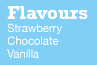
Using Roboto Slab as the headings and Helvetica Neue as the body copy. This is something that I think works quite well, although I think that applying it to something that would actually be used in our brand would be better to test it on.
Trying the typefaces out on all of the colours made us see that it looks a bit too plain, therefore we started looking again at more typefaces, and we are sure that we want to have the heading and the body copy as two different typefaces, using one as a serif and one as a sans serif.
Mel found a typeface called Keep Calm Medium which she thought would work really well for the headings, and I thought that Roboto Slab would go very well with it as the body copy typeface. These are the typefaces that we have both decided that we wanted to use.
Summary.
This has been a very successful and productive day/meeting. We have worked out what we want our brand aesthetic to be, the colour choice and typefaces. We have also started to talk about what we will be producing for the brief including;
Logo
Branding
Signage
Menus Wall
Menus Table
Cups and Straws
Labels
Jars of Goodies
Cup Holders
Cookie Range
Loyalty Cards
Social Media
Online Presence
This is something that we are going to move on with, and meet up in a few days to distribute the jobs evenly, this is so that we can make the most of our time and each of our skills.


No comments:
Post a Comment