Research.
Before designing any of the coasters or packaging for the take away
food, I decided to research into existing things. I think that it is
important to keep the concept that the brand has two sides to it, a
simple and to the point type side, with an underlying pattern on the
back, that connects with our two different target audiences.
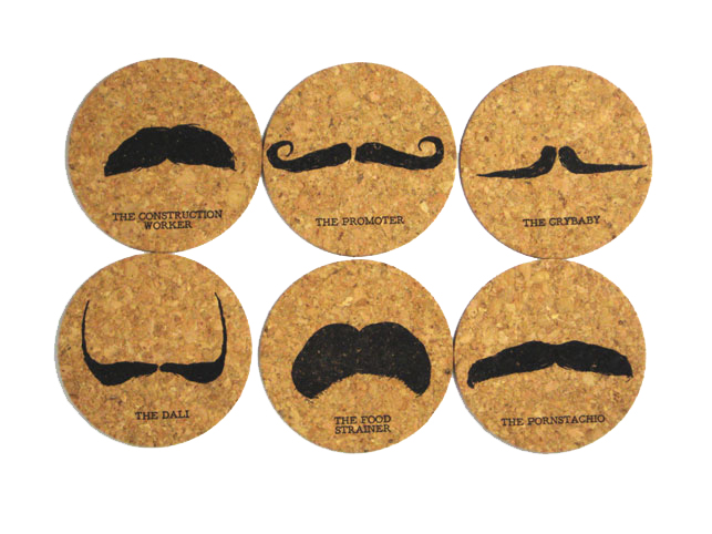
Coasters.
These coaster are quite fun and playful. It is something that I want to achieve, a playful tone of voice with the coasters I am designing. Because the milkshake shop is intended to be quite fun and friendly, an approachable brand which you can trust.
Using quote on the front of the coasters might help to create the simple type side of the brand, with an underlying pattern used on the background. This is something that I will consider when making the coasters.
Using one simple image could work well. Using one of the illustrations from the patterns and enlarging it might work well. Although it would be hard to relate the coasters to the milkshake flavours. I will also consider the stock choice, as this will be important for the design process. I could use a coloured stock and screen print white onto it.
What is the most important for the coasters and the whole brand itself is to make sure that they all work as a set. This needs to tie into the brand itself, and communicate the right tone of voice. This is something that I will consider when making all of my printed ephemera that comes with the brand.
Having text on one side and an image on the other works really well. This would also suit our concept of have of having two different sides of the brand. I think it is important to include something on the back of the coasters to be in keeping with the brand.
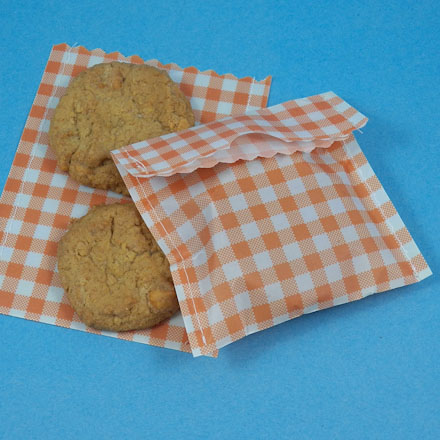
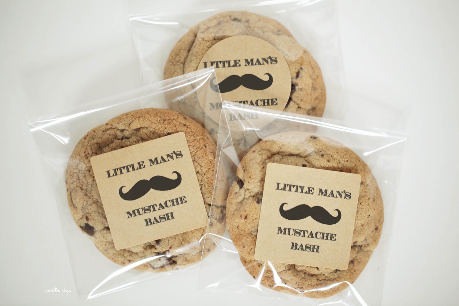
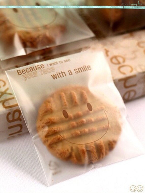
Cookie Packaging.
When initially thinking about the cookie packaging and how we should make them, I thought that using a simple pattern like the three examples above would work well. Until researching into the packaging that I could use I thought that this would be the best for our brand. Although I think that it might be using the striped pattern a bit too much throughout the brand. Also this is the underlying pattern throughout, therefore I don't think that it should be used.
This would be a really good idea for the cookie packaging, it would give me the opportunity to use the cakes and cookie pattern on the front of the labels, but also allows the customers to see the cookies that they will be buying. Allowing the customers to see is important, as often people don't want something until they actually see it.
As in the two examples above, the the packaging is playing with the objects on the inside. This would work well for the brand as it is intended to be playful. Although I wouldn't want to it to be too detailed and cluttered. Therefore this is something I need to consider when making.


No comments:
Post a Comment